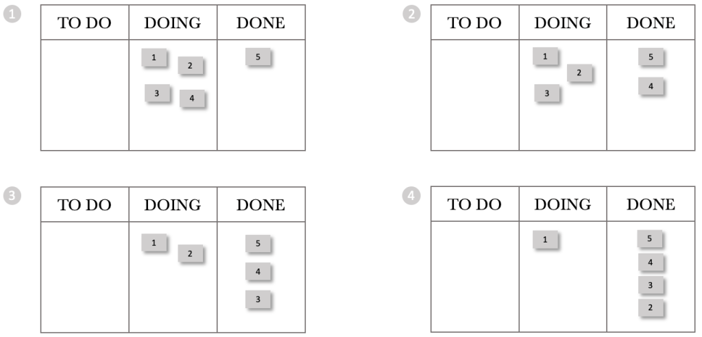
We’ll start our exploration with some basic flow principles. Consider a situation where you are managing a team. This team is capable of servicing four requests per day. Requests are received at the start of the day, and the team processes them in the order received.
The team is part of a start-up, and while they can service four requests per day, currently, the company only receives three requests a day. Let’s take a look at the system diagram below that illustrates our situation.
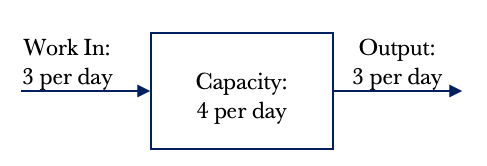
The diagram above shows that we have an input of 3 requests per day. We also have the capacity to service four requests per day. Logic dictates that if we receive three requests per day and can service four requests per day, we will have an output of 3 requests per day. In other words, we can service every request received as our capacity exceeds demand. The demand placed on the team is three requests per day. Work In Progress is a term we use to denote how much active work we have. In this example, our Work In Progress or WIP is zero. We do not have any WIP at the end of the day as we have serviced all requests, and no leftover work is pushed into the next day.
*Note: I use the words jobs and requests interchangeably. They mean the same thing in the context of making work flow.
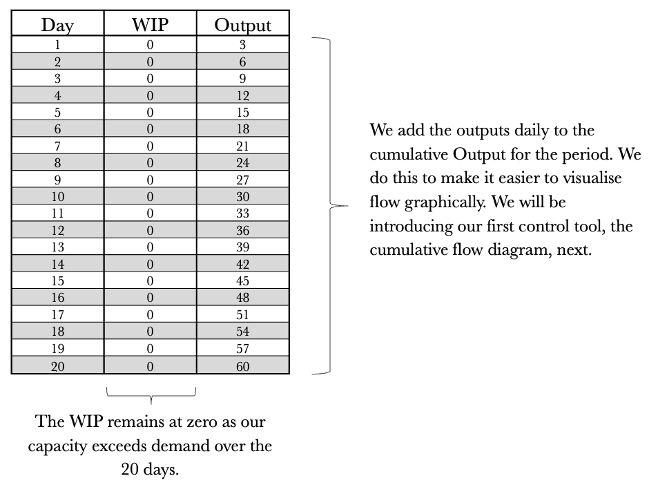
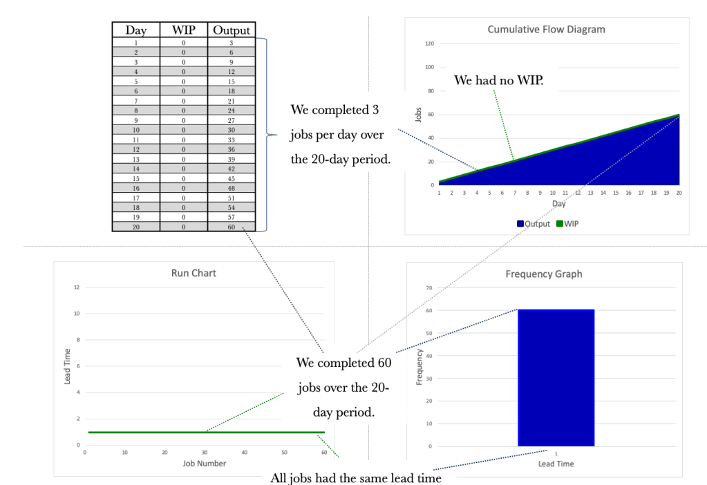
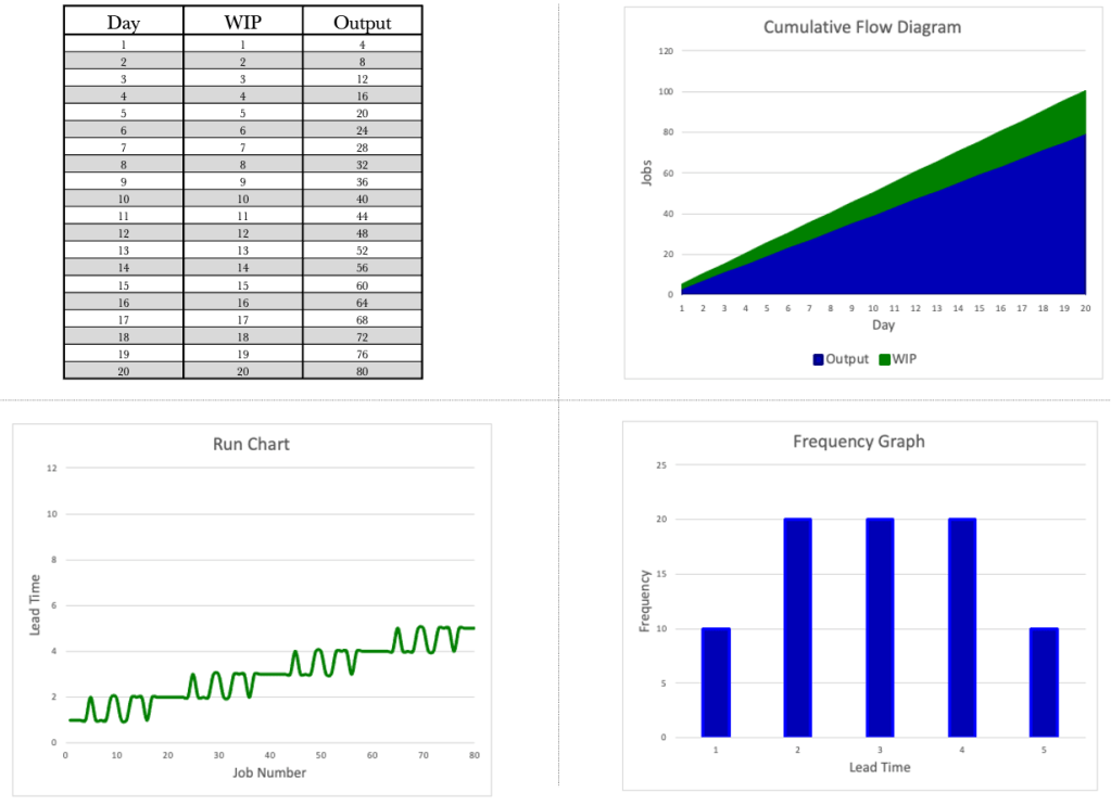
Let’s take a look at the situation over 20 days. The table below shows the day, the WIP and the Output per day. We know that we have a demand of 3 per day and a capacity of 4 per day.
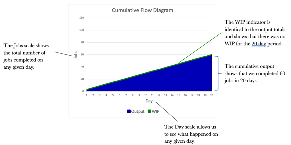
While the table provides us with the base data and is a good reference for analysis, we need to visualise the data so that we can get a feel for what’s happening at a glance. Visualising flow is where the Cumulative Flow Diagram (CFD) comes in. Let’s map out the CFD using the previous table.
When graphing the CFD, we always want to start with the output as the first series and then build backwards from there. For instance, if our Kanban board has a TO DO, DOING and DONE column, we would graph the CFD starting with the DONE column, the DOING column, and finally, the TO DO column. The cumulative total of completed work is what gives the tool its structure.
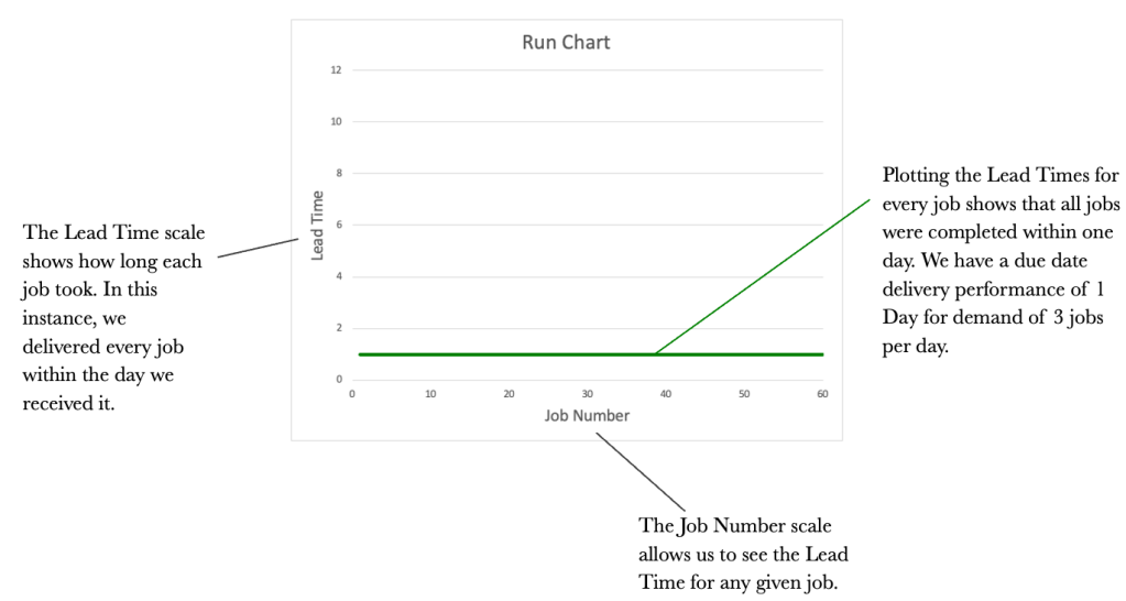
The CFD is an excellent way of visualising flow over time. We should not underestimate its power as a communication tool. While the CFD provides a good flow view, it would also be good to see how each job performed and how long each took. This is where the Run Chart comes in. It would be good to know how long it took us to complete every job that we had. Staying with our three jobs per day theme, let’s introduce a Run Chart to the mix.
We will look at a Run Chart for the 20-day period that dovetails our CFD and the original table.
We now have the Table, the CFD and the Run Chart. We will round out our control tools with one more graph. This is the Frequency Graph. The Frequency Graph shows us how many items were delivered with the same lead time. Again using our example of demand of 3 per day, let’s look at a Frequency Graph.

The 4 tools used together provide us with a complete picture of how our work is flowing. Let’s take a look at them all together and see if we can tell a story just by reviewing the tools and with no context provided.
The tools all tie together and provide us with differing views of how work is flowing. The tools may seem redundant at this stage, but I assure you they will offer you valuable insight as we progress. The important thing for us is to know that the tools exist and to use them to garner insightful information.
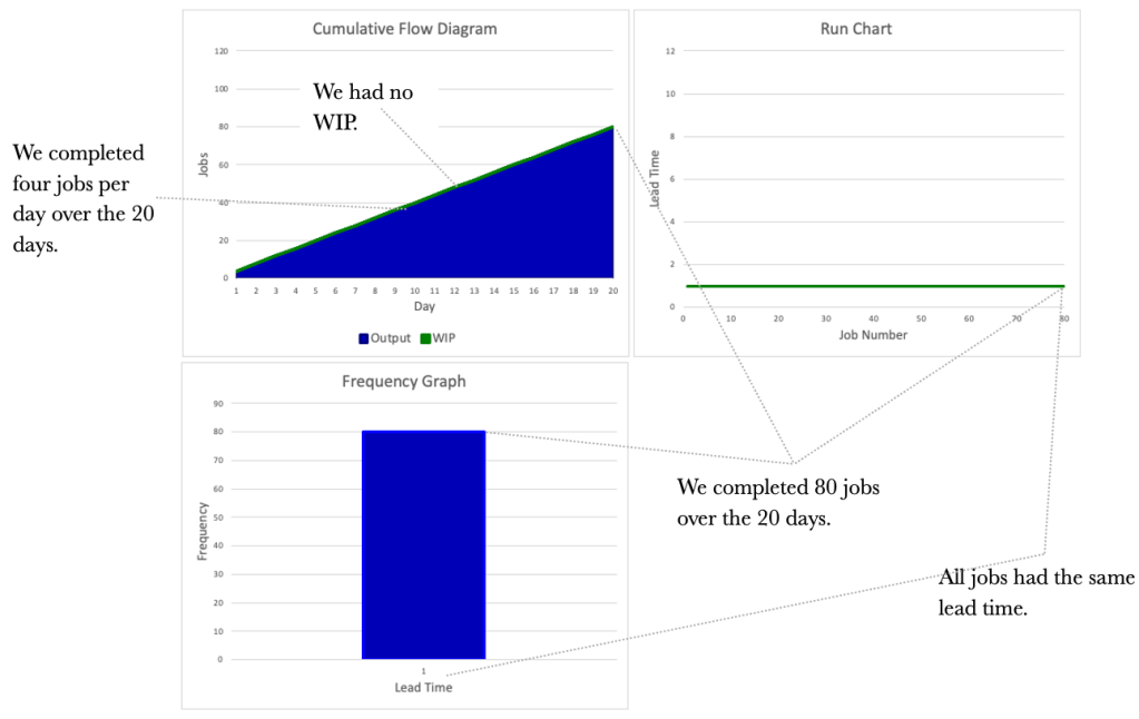
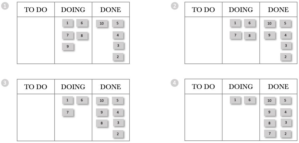
Let’s consider the situation below. We have increased demand to 4 per day and kept capacity at 4 per day. Again, logic dictates that if we receive four requests a day and can service four per day, our output will be four per day.

Again, we see no WIP, as we can service all requests on the day they are received. The table below shows the flow over 20 days. Note that our output increased in line with our input as we had the capacity to deal with the increase.

Let’s turn to the three diagrammatical tools and see what information we can glean from them.
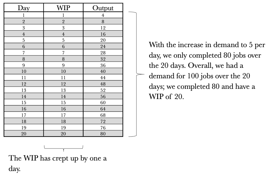
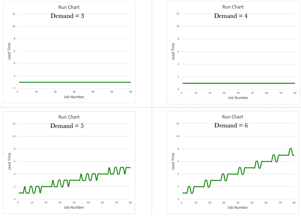
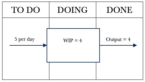
So far, we have considered a couple of simple situations where demand is less than or equal to capacity. What if demand exceeded capacity? A demand that exceeds capacity is closer to reality for most of us. Let’s increase the demand to 5 per day while keeping our capacity at 4 per day. The first step is to draw the system representation of the situation we face.

We now notice something interesting. Our demand has increased to 5 per day, but our output has remained at 4 per day. A demand exceeding capacity is a common phenomenon and something we must keep in mind as we progress. We cannot deliver more than we can produce. In this case, our capacity is constrained to 4 per day. We can push as much work as we want into the system, but it will only produce 4 per day. Our team is known as a Capacity Constrained Resource (CCR) in this situation. We are constrained to completing 4 jobs per day. Let’s have a look at the table below outlining 20 days of activity.
Let’s turn to the three diagrammatical tools again. We see that they look very different now and provide much richer information. Let’s see what we can glean from them, taking them each in turn. We’ll start with the CFD.

Let’s turn our attention to the Run Chart and see what information it presents us with.
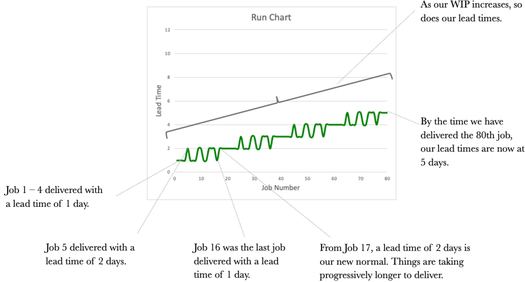
The information we get from the Run Chart allows us to assess the lead times for each job. What we notice overall is the unpredictability of our delivery times. How are we ever to commit a date to our customers with ever-increasing lead times? An essential item for us to note is that lead times increase with an increase in WIP.
Our third and final tool, the Frequency Graph, is shown below.

The frequency Graph shows us how many jobs were delivered and with what lead times. It does not show us the delivery order.
Consider the tools side by side now as we did previously. We see a different picture than before. We see that our WIP and our lead times are worsening. Our output has remained constant at 80 over the 20 days, consistent with a Capacity Constrained Resource (CCR) that delivers four jobs per day.
What would happen if demand increased to 6 per day? Consider the results below.

In our journey so far, we have uncovered two crucial items.
1. The CCR determines the Output.
2. Lead Times worsen as WIP increases.
Let’s look at each of the tools in turn, comparing and contrasting them between the different demand rates. Let’s start with the CFD.

The Run Charts.
The Frequency Graphs.

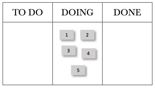
Let’s tie together what we learned and apply it to our Kanban board. Consider the simple Kanban board below.
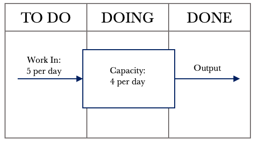
We have all seen a board like this or something similar. The boards are typically littered across office walls and usually have many sticky notes or cards all over them. Kanban boards are a familiar sight but have we ever looked at one with a system lens? When we look at a board, we should see something like below. Looking at the board in this way will help us view our boards as not just a place for sticky notes to live but a working system that we can use to manage work.

When we start viewing our Kanban boards as systems, we can begin to unlock their inherent power. We can also start applying the control tools we have worked through thus far. The tools will help us better manage the flow of work.
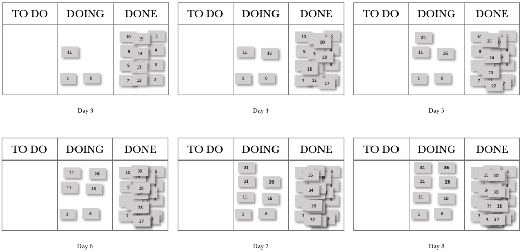
Before we explore treating our boards as systems, I think it’s essential for us to understand how processing order affects lead times. Let’s take our previous example, where we had a CCR limited to servicing four jobs per day and a demand of 5. Let’s first consider a situation where we process in a First In, First Out (FIFO) order. We will number the jobs as they come in and work on the lowest number first. Let’s first set up the board.
We will push these into the DOING column as work comes in daily. The figure below shows the start of Day 1. The ticket numbers reflect their job numbers starting at 1.
The card movements on the board below show progress through the day.
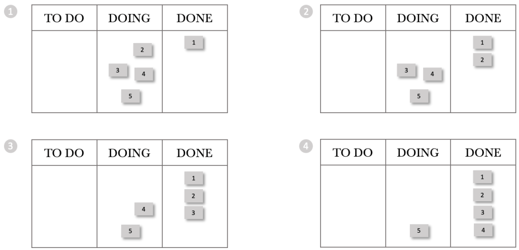
We have processed jobs 1 through 4, and 5 remains in our doing column. Stepping through the next day, we again received five requests and pushed these into the DOING Column.
The sequence for Day 2 is shown below.
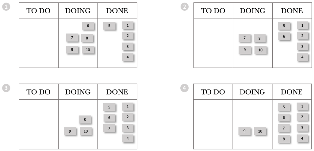
At the end of Day 2, we have processed jobs 5 through 8 and jobs 9 and 10 remain in our doing column. Stepping through the next day, we again received five requests and pushed these into the DOING column. We are starting to see a trend already. Every day we stgh the board, we gain more WIP. Day 1 had a WIP of 1, and Day 2 had a WIP of 2. Logically Day 3 will have a WIP of 3, Day 4 a WIP of 4 and so on. But what about the lead times? We can see from the boards above that we delivered jobs 1-4 on the day they arrived. We delivered job 5 the next day.
Continuing on our journey, let’s look at the end of the day for the next few days.
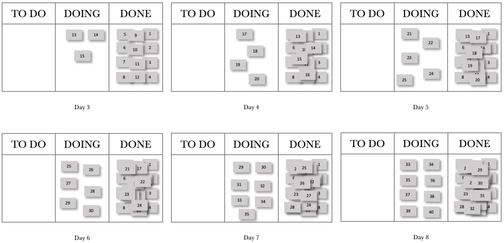
At the end of day 8, we had completed 32 jobs and had a WIP of 8. The thing for us to note with FIFO is that work that comes in each day falls further and further behind, or in other words, our lead times increase over time. What would happen if we changed our processing order from FIFO to Last In, First Out (LIFO)?
Let’s step through the first day of a LIFO processing pattern. This pattern represents when work enters, and we pick the next item from the top of the pile.
At the end of the day, we have processed jobs 5 through 2 and 1 remains in our DOING column. Stepping through the next day, we again received 5 requests and pushed them into the DOING Column.
The sequence for Day 2 is shown below.
At the end of Day 2, we have processed jobs 10 through 7, and jobs 1 and 6 remain in our DOING column. We see that the pattern between FIFO and LIFO remains intact if we were to use a CFD. In both cases, we complete 4 per day and increase our WIP by one a day. If we were to plot a CFD for 20 days, it would look the same for LIFO and FIFO. Let’s step through the next few days and see what happens with our board.
Continuing our journey, let’s look at the end of the day for the next few days.
At the end of day 8, we had completed 32 jobs and had a WIP of 8. These are the same results for FIFO, but our lead times per job are very different. Let’s construct run charts for the eight days and compare the FIFO and LIFO processing orders.
Consider the FIFO and LIFO Run Charts over the eight days. The Run Charts contain both completed jobs and WIP. I have shown both to compare and contrast the wait times for WIP and the lead times for completed jobs.

Let’s first consider the completed job lead times. For FIFO, we see that the lead times increase over time. Contrasting that with LIFO, we see that all completed jobs had a lead time of 1 day. Considering the wait times for WIP, we see that FIFO’s longest wait time is two days, whilst LIFO has an item waiting eight days to be processed.
What would happen if we processed our jobs in a random order? What would happen to our lead times and wait times then?
Using the same process as before, where we have a demand of 5 per day and have a capacity-constrained resource that can process four jobs per day, let’s look at the run chart for random job processing.

As can be expected, the wait times and lead times for random processing are haphazard. We detect no consistency or pattern.
We can derive from our exploration of processing order that the order in which we process jobs is crucial, especially when we have a CCR in play.
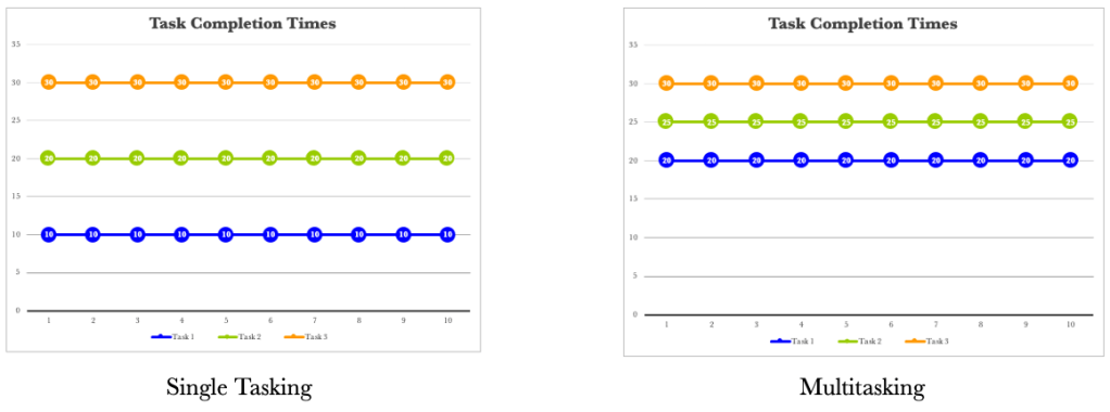
The other area we need to consider is multitasking. Multitasking can have detrimental effects on lead and wait times. Let’s take a look at a simple example below. We will consider three tasks that each take ten days to complete. Let’s start with Single-tasking. We will start a job and not switch until it is complete. We will complete them in the order they are received or FIFO.

We start Task 1 and complete it on day 10. We then pick up Task 2 on the 11th day and complete it on day 20. We pick up Task 3 on day 21 and complete it on day 30. Our lead times of 10 days are predictable for all 3 tasks. If we ran this over 10 iterations, we would expect to see the same thing over and over again. The table and figure below show the results over 10 runs.
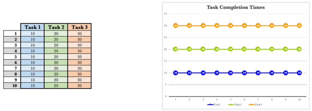
There are no surprises here. Every run produces the same output. There is predictability in our lead times.
What if, for some reason, we switch tasks every five days? How would this affect our lead times, if at all?

If we consider Task 1, we started on day one and stopped on day 5. We then picked it up again on day 16 and completed it on day 20. Our lead time for Task 1 has moved from 10 days to 20 days. We have, in effect, doubled our lead time by switching tasks halfway through.
Consider Task 2. We started Task 2 earlier than when single-tasking. We started Task 2 on day six and stopped on day 10. We picked it up again on day 21 and completed it on day 25. The lead time for Task 2 with single-tasking was 20 days, and is 25 days for switching halfway. We started Task 2 earlier and finished it later.
Turning our attention to Task 3. We started task 3 ahead of single-tasking by ten days. We did, however, complete it on day 30, just as with single-tasking. Let’s compare and contrast the results between single-tasking and multitasking when switching halfway through a task.
Let’s consider one more situation where we have multiple but equal switches. Let’s assume that we switch tasks every two days.

The same trend appears again. We tend to start tasks earlier and complete them later, except for task 3, which finishes on the 30th day. The trend diagrams below show that our completion times are progressively later the more frequently we switch tasks.
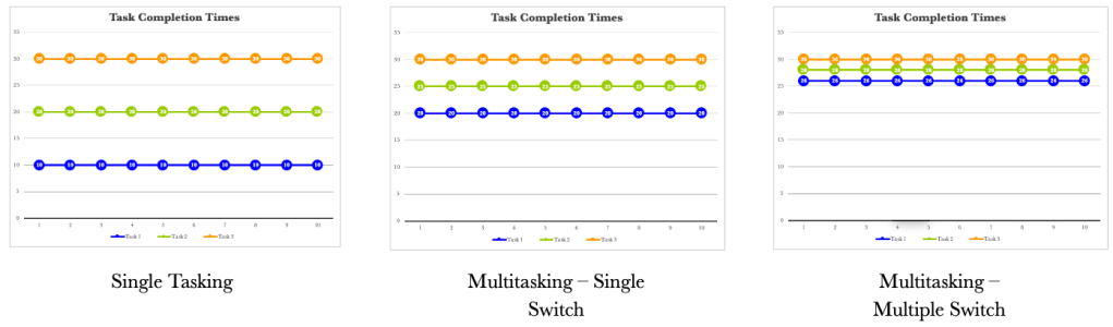
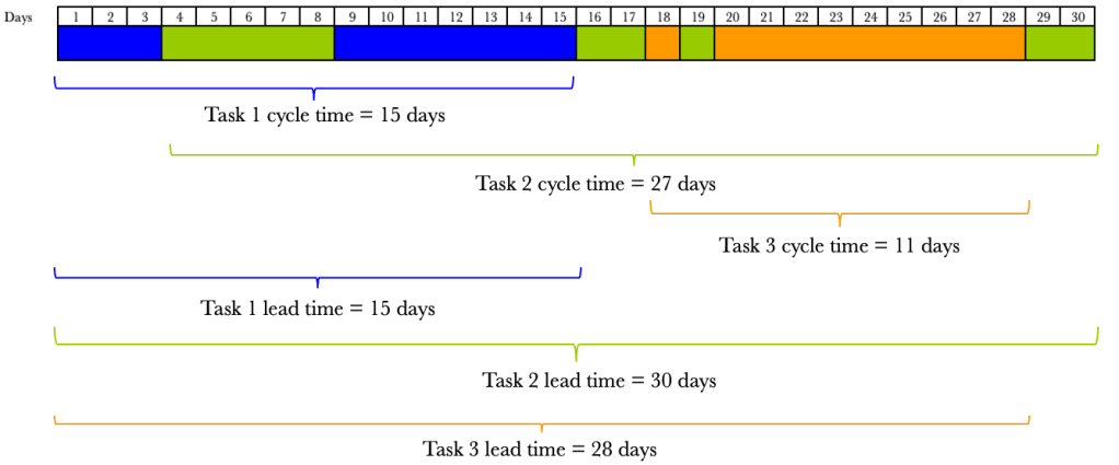
The more we switch, the more tightly together our three tasks are completed. It is not just the lead times that are affected when we task switch. Our cycle times also vary.
Cycle time is the time the task takes to complete once started. Lead time is the total time from request to fulfilment. Let’s take our previous example and show the cycle times and lead times for each situation. We’ll assume that we receive all tasks on day 1. We will consider the single-tasking example first.
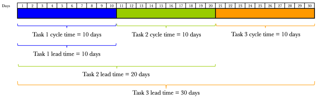
We see that the cycle times for single-tasking are predictable and are all ten days. What we do notice is that our lead times vary. The lead time for Task 1 is 10 days, Task 2 20 days and Task 3 30 days. The varying lead times are due to the amount of time the task sits waiting to be processed. What about when we switch tasks halfway? We have already seen the effects on lead times, but the effects on cycle times are also dramatic.
The figure below shows the effects on cycle times and lead times when we switch tasks halfway through.
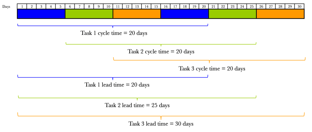
By switching tasks midway through, we have doubled our cycle time. It now takes 20 days to complete a task once we have started it. So not only have our lead times increased, but so have our cycle times. Let’s look at the effect of multiple switching.
The figure below shows the effects on cycle times and lead times when we switch tasks on multiple equal occasions.

Again we see the worsening cycle times. The more we switch, the more our cycle times increase. We have already seen that the more we switch, the more our lead times increase.
We also know that life doesn’t allow us to switch tasks in order. In the previous examples, we highlighted trends when we increased switching uniformly. What would happen if we were allowed to start tasks randomly as well as switch on demand? Let’s consider an example.
We now see that our cycle times and lead times are all over the place, and there is no predictability. This is a situation we want to avoid. While we can see the chaos tasking switching causes, many of us work like this daily.
Let’s make a pact now. We need to minimise task switching as much as possible. There will be occasions where we need to switch tasks, which is a fact of life, but for the most part, we need to eliminate task switching.
Now that we have considered processing order and task switching let’s go back to our board. As a reminder, we want to start viewing our board in the manner shown below.

Let’s go back to our situation where we have a capacity-constrained resource that can service 4 items a day with a demand of 5 requests per day. Let’s overlay the position on our board.
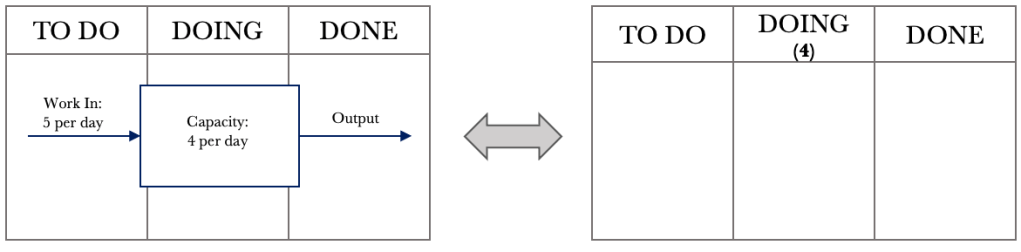
In the DOING column, we add the number 4 below the DOING label to denote a capacity-constrained resource that can service four requests per day.
From our previous FIFO example, let’s take day eight. We will again assume that we will be processing jobs in the order they are received or FIFO. We will be making some changes to how we manage work and will see their effects one at a time.

We are going to make two changes. One, we are going to move from a ‘push’ system to a ‘pull’ system. What does this mean? Previously, when jobs came in, we would push them into doing as soon as they came in. When jobs come in now, we will place them into the TO DO column. When we finish a job in the DOING column, we will pull a new one from the TO DO column. The second change we will make is to limit our work in progress to our CCR limit. For our example, we have a CCR of 4, so we will have a WIP limit of 4. The ‘4’ that we placed under the DOING column now shows the maximum number of jobs in the DOING column at any one time. Let’s have a look at the effect of these two changes. Consider day nine below.

The jobs that came in are placed in the TO DO column. We can see that our WIP limit in the DOING column has been breached. We have eight jobs when we should only have a maximum of 4. Let’s step through the next few days and see the effects of the changes we put in place.
During day 9, we process jobs 33, 34, 35 and 36. At the end of day 9, we have a board that looks like what is below.

Our board now shows that we are not in breach of our WIP limit. We have accumulated five jobs in the TO DO column. At this stage, we have reduced our WIP by four and have grown our backlog by 5. Let’s look at day 10.
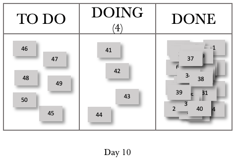
For Day 10, we completed jobs 37, 38, 39 and 40. We pulled jobs 41, 42, 43 and 44 into the DOING column. We also added jobs 46, 47, 48, 49 and 50 to our backlog. These five jobs, and job 45 that was not pulled into DOING, now give us a TO DO or backlog total of 6. Let’s look at one more day.
Consider day 11 below.
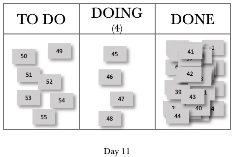
Day 11 now mirrors day 10 in behaviour. We completed four jobs. We have four jobs that we are working on, and we have grown our backlog by 1. We can represent this in a systems view, as shown below.
We see from the figure above that we have managed to keep our WIP constant, and our CCR governs our output. We will have a net increase of 1 job per day, accumulating in our backlog or TO DO column.
Let’s take a look at a CFD over 20 days, where we introduced our changes on day 9.
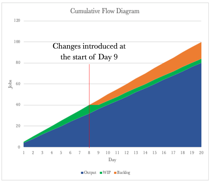
The CFD now shows that we have a constant delivery rate of 4 per day. We had a growing WIP up to day eight, and then this tapered off to a constant of 4 per day. We now see that our backlog is growing as we progress.
Let’s compare the CFD above with the CFD for the push system.
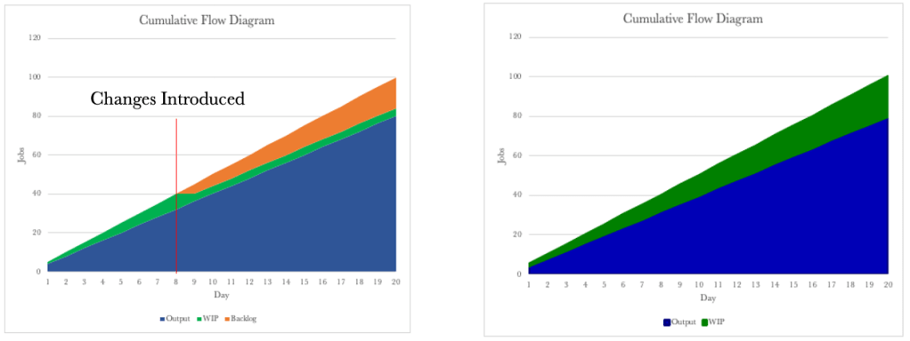
The CFDs look similar, and it looks like the only change we have made is to move the WIP into the backlog. By putting in place a WIP limit, we have reduced the ability to multitask. The WIP Limit will allow us to focus on finishing the work we have started. We now also have a consistent cycle time.
Let’s go back to our systems diagram for the moment and draw it slightly differently to have it represent our way of working.
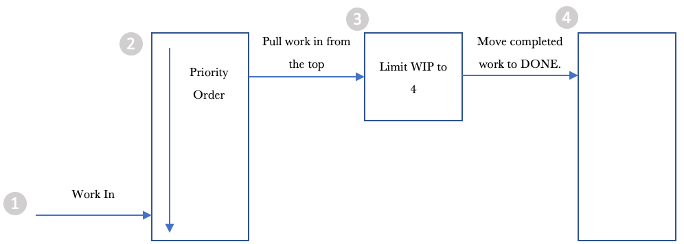
Let’s step through the diagram from left to right.
- Work comes in, and we add it to the list of things to get done.
2. We order the backlog or the jobs in the TO DO column to make it easy to pull work into the DOING column.
3. We pull work into the DOING column from the top of the pile.
4. We move the job to DONE when once completed.
What we have done is limited WIP, and we have deferred commitment to start work by placing it in the backlog or TO DO column. The deferring of commitment provides us with a lot of control. We know that if we start a job, we can complete it with a cycle time of one day. We also know that we can process four jobs a day. We also know that our backlog grows every day. Most of us work with ever-growing backlogs of work. However, we can now take advantage of a deferred commitment and start to order the backlog in a manner that best delivers value to our organisation or customer.
We are now in control of what work we release and when. We can prioritise our work based on what our organisation or customer wants or values most. The most important thing to note is that placing items in our TO DO column will affect the order in which they get delivered. We can now work with our stakeholders to determine what they want to be delivered and in what order. Our order now sets the priority of work to be processed.
Order is critical as it allows us to work with our customers/stakeholders and helps set and manage expectations. We can provide estimates by knowing our cycle time and our output per day. Let’s go back to our example, where we can process four jobs per day. Take the ordered backlog below into consideration.
Our backlog is now ordered in line with the needs of our customers/stakeholders. Each job gets a sequential number when received, and we can see that our backlog does not align with this order. Instead, it represents the order that aligns with our customer’s/stakeholders’ needs.
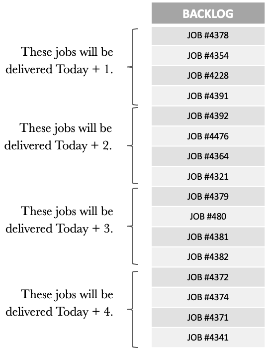
Knowing that we can process 4 daily, we can now tell what jobs will be delivered and on what day. We have easy conversations with our customers/stakeholders to show where they are in the backlog and when they can expect their jobs.
We can also work with our customers/stakeholders to change the order of the backlog to cater to any new high-priority jobs. When new higher-priority items come in, we can also show how these will impact other jobs in the backlog and manage expectations accordingly.
Managing our backlog and ensuring that our jobs are in the order that most reflects the needs of our customers/stakeholders is vital for us in moving to a proactive way of working. Getting the backlog under control is probably the most challenging, but also brings the most significant benefit.
So far, we have seen that:
• Our Kanban boards are visual representations of systems.
• Our CCR determines the rate of our output.
• We can use the CFD, Run Chart and Frequency Graph to track work and gain insights into our performance.
• Putting in a WIP limit allows us to focus on finishing.
• Multitasking is destructive and should be minimised as much as possible.
• Deferring commitment allows us to order the work in our backlog to closely match what is wanted most by our organisation or customers.
One of the things we have not spoken about yet is work that gets stuck or blocked once we have started working on it. Let’s round out our discussion on flow by considering the effects of blocked work and look at what we can do about it.
Taking the board below into consideration. Let’s work through blocked items and see what effects this has on how we work. The board below shows a WIP limit of 4, and the cards with a dot on them show blocked work.
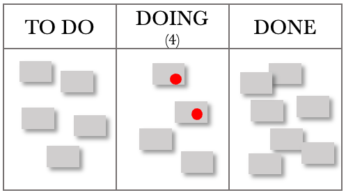
Considering the situation above, we have obeyed our WIP limit, and two jobs are blocked. They could be blocked for several reasons, e.g., waiting for feedback/input/expertise or simply not having everything we need and so need to complete the work. However, this situation leaves us with an underutilised capacity to work on a task that is now blocked, and we cannot pull a new one from the backlog.
We need to modify our board slightly when dealing with situations where work is blocked, as per the figure below.

We create another swim lane within our DOING column and place all blocked work here. We don’t need to add any WIP limits to the BLOCKED column. The board below shows an updated view.

We can now pull another two tasks into the DOING column and commence processing work on other jobs. Our role as managers comes into play when we have blocked work. Our job is to determine why they are blocked and ensure this does not recur. The rest of the board belongs to the team, but the BLOCKED section is ours.
We could also have one team member work on the blocked items while the rest continue to service requests. Once requests become unblocked, we must pull them from the BLOCKED column before getting new work from the TO DO Column.
As managers, we are looking for patterns that cause work to get blocked and eliminate them. We are also proactively looking for ways to ensure that once we start something, we can finish it. The BLOCKED section of the board provides feedback on where to focus our efforts so that we maintain a steady flow of work through our department. One of the managerial changes that we should add to the board is a ‘FULL KIT’ column. This column checks to see if we have everything to complete the job. If we don’t have everything, we should not start it. Let’s look at the modified board below.

Our board now provides us with a good structure for most situations.
• Our TO DO column collects all the work expected of us. We can then order and release the most valuable work to the organisation or customer, ensuring they receive the high-value items first.
• The FULL KIT column provides a check to ensure a high likelihood of us completing the job when we start it. If we find that we are often missing items in this stage, this provides excellent feedback on where to focus our attention and eliminate those deficiencies.
• The DOING column limits our WIP, ensuring we focus on finishing.
• The BLOCKED column provides managerial focus and feedback that we can use to eliminate the situations that cause and result in blockages.
• The DONE column records the excellent work we have delivered.
We now have a functional, templated Kanban board that we can use as a start and build on if we don’t already have one. The board, the CFD, the Run Chart and the Frequency Graph will provide the insight and information needed to manage and improve your work.
A PDF copy of the book can be found here: Unlocking the Power of Kanban
The physical copy of the book can be found here: Unlocking the Power of Kanban
