So far, we have seen how work flows using constant values. Nothing we do is uniform. We have variability at every turn. The amount of work we receive daily is variable, and our demand varies. Our daily capacity varies as we have meetings to attend, go on leave for a well-deserved break or encounter issues we need to resolve. Despite all this variability, we still need to ensure that we maintain a constant flow of work through our department or team and maintain predictable delivery times.
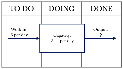
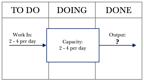
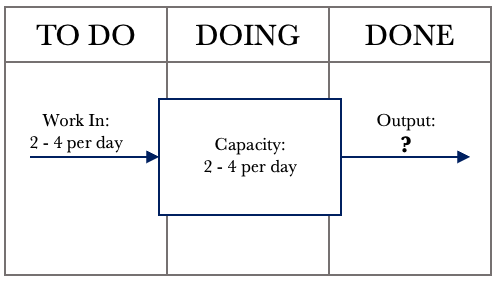
This chapter will focus on variability and show the effects that variability has on our work output. We use our systems diagram, which is representative of our Kanban board. Let’s examine the example below, where our daily capacity varies. We will assume a consistent demand of 3 per day and a variable capacity of between 2 and 4 per day. We can assume that things will level out over time, and we will meet our commitments.
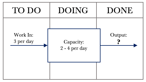
The diagram above shows that we constantly input 3 requests per day. Our capacity to service requests varies between 2 and 4 requests per day. Logic dictates that if we receive three requests per day and can service between 2 – 4 requests per day, we will meet our commitments over time. Given that we can service between 2 – 4 requests per day, we need to see the impact on Output.
Many things can affect our capacity to service requests. Our days are not all uniform. We have administration tasks to tend to, issues to resolve, urgent requests that come in, and meetings. None of these items is standard. For instance, we could have one meeting for an hour on a given day and the next day have 7 hours of meetings. All this other work affects our ability to make full use of our capacity.
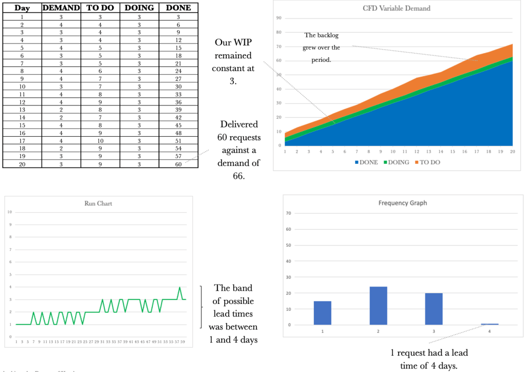
The tools we have used so far will give us a good picture of how our system behaves over time or how our Kanban board is performing. Our goal is to always ensure that we have work flowing as smoothly as possible. Let’s take a look at the data table over 20 days.

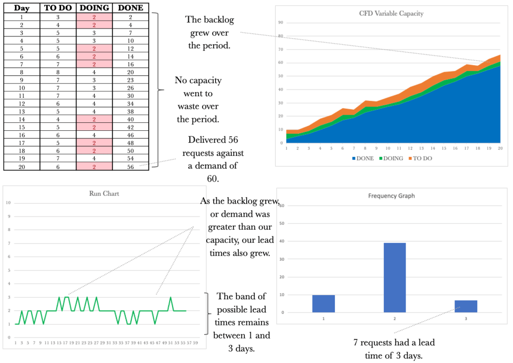
The table above shows our performance over 20 days. Let’s walk through the first day. On day 1, we received three requests, serviced all three and in line with that, our output was 3. It was a very stable day. On Day 2, we received three requests again. On this day, we could service four requests. For this day, our output was three, and the available capacity we could have used to service additional requests went unused. I have highlighted these situations in green so they are easy to see. On day 3, we again received three requests and were able to service only 2. Our output for that day was 2. In this instance, the demand for the day was greater than the available capacity. These situations are highlighted in red.
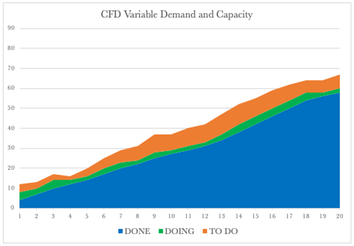
Overall we see that things balanced out as we first suspected. We managed to service 59 requests with a corresponding demand of 60. Not a bad performance, given we had variable capacity. Let’s have a look at the corresponding CFD.
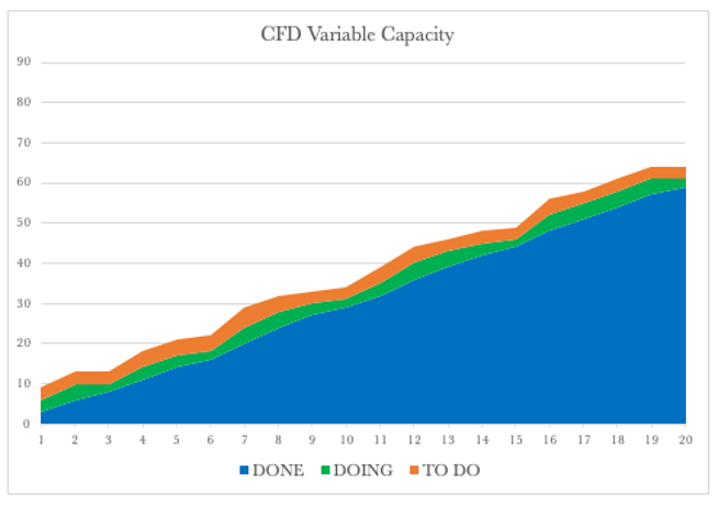
The CFD shows a steady climb over the 20 days. The backlog or our TO DO remains relatively stable, and so does our WIP, and our delivery over time rose steadily. Let’s have a look at the Run Chart over the same period.
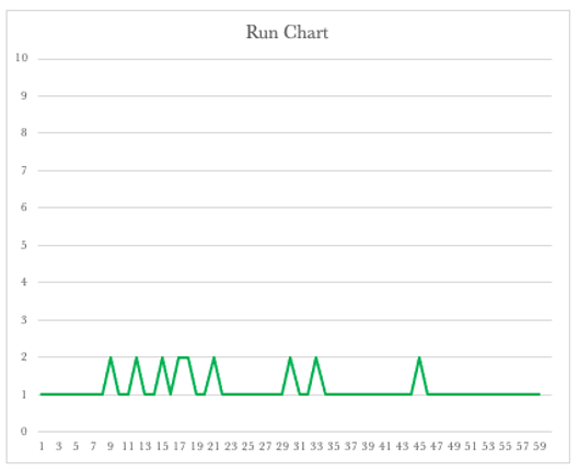
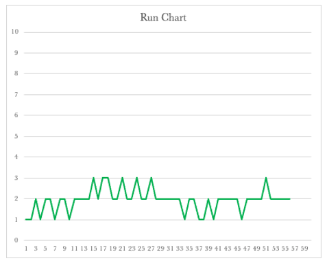
The Run Chart shows we had lead times of 1 or 2 days. The run chart shows that our lead times will vary depending on our available capacity. It also shows that we should expect that some of the work we have will be delivered in 2 days and some in one day. This view now shows the bands in which our lead times should fall to be considered normal.
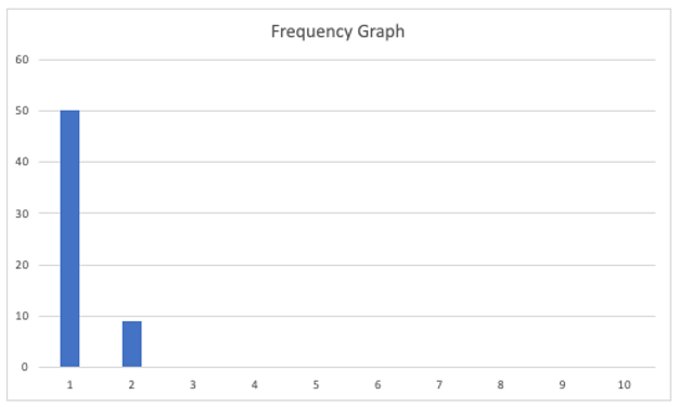
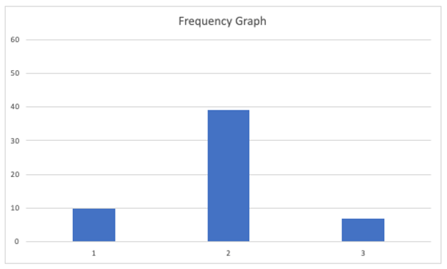
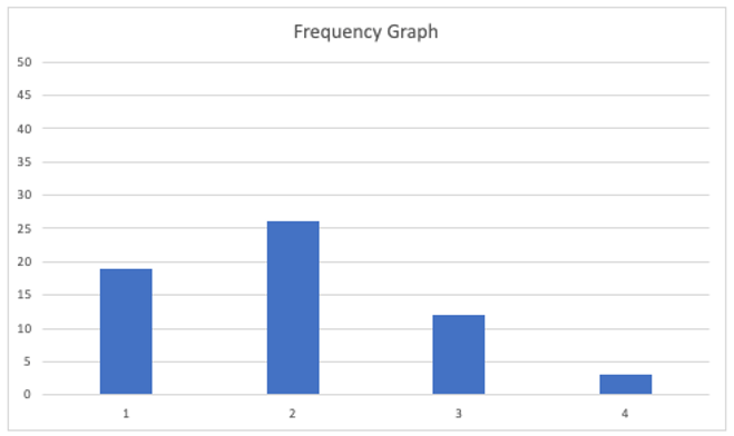
Let’s turn our attention to the Frequency Graph shown below. The graph shows that we delivered 50 requests with a one-day lead time and nine on the second day.
By collecting and presenting this data, we may be satisfied overall with our performance over the 20 days. Unfortunately, when dealing with variability, there can be many outcomes. We have looked at one that mostly mirrored our assumption that things would level out. We have already seen that with variable capacity, there are times when some of our capacity goes unused. We refer to this situation as ‘being starved for work’. We have also seen that there are times when we are unable to service demand, and our backlog grows. We refer to this situation as ‘being overburdened’.
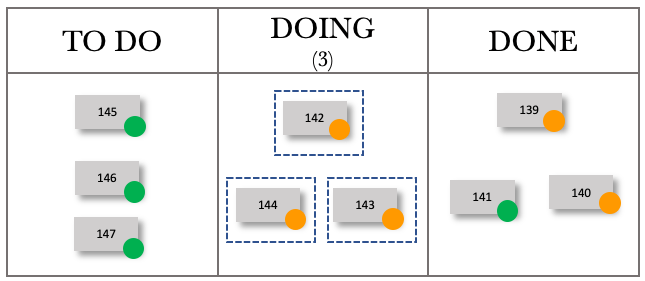
Over the following few pages, we will look at more runs of the simulation to gain further insight into the effect of variability. We will consider the table and the CFD together and then the Run Chart and Frequency Graph together. We will keep the demand constant at three and vary our capacity between 2 and 4.
Below is the output from another run of the simulation. We will again be able to see differences between the previous runs.
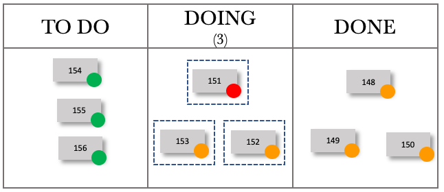
Let’s have a look at one more run before we move on.
Let’s take one of the runs and use the data to inform our Kanban board. Let’s start with mapping the system out on our board.
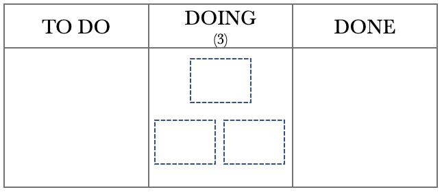
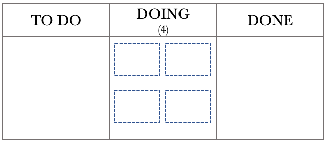
From the above diagram, we see that we can deliver between 2 and 4 requests per day. Let’s develop our scenario further and assume that we are the leader of a team of 4. Each team member services one request per day. Sometimes individuals are caught up with administrative matters, issue resolution or may be absent from work. All of this affects our daily output. Let’s set up the board to represent this situation.
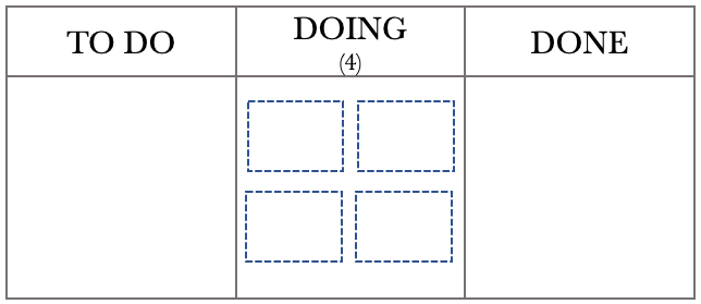
The Kanban board above shows that we have a team of 4, represented by the four boxes in the DOING column, and a WIP limit of 4. With a WIP limit of 4 and 4 team members, we effectively have a WIP limit of 1 per person. Individual team members will pull from the TO DO column when they have completed the task. We have chosen this configuration to help with minimising multitasking. Before we step through the day, let’s use the previous month’s data to help us with planning.
The Run Chart and Frequency diagrams below represent our performance over the last month. We will use this historical data to help us track work as it moves through the board.
The Run Chart shows that our lead times for the last month varied between 1 and 3 days, while the Frequency Graph shows that we delivered most of our requests on the second day. This is beneficial information that we can incorporate into our board to give us a real-time performance on how we are tracking. The first thing we need to do is to set up a traffic light system to label our tickets on the board. Using the standard Green, Amber, and Red system, we will put a green dot on any work added to the board. If the work remains on the board for the second day, we will replace the green dot with an amber one. If the job is still in place on the third day, we will label it with a red dot.

The Kanban Board below represents the close of play on the 20th day. We will use a FIFO processing order so it is easier for us to track the work through the various stages.
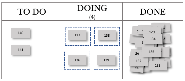
The board above shows that each team member has pulled work from the TO DO column, and all have something in progress. The board also shows that we have two items in our backlog. We need to note that with our WIP limit of 4, our team will always be working on something. Their ability to complete their assigned work on the day is affected by the amount of other activity they have on that particular day.
Examining our previous month’s performance and knowing that our lead times vary between 1 and 3 days, we can now take our board and add tracking to the tickets. We add amber dots to the tickets to show they are on their second activity day. The board at the start of day 21 with tracking is below.

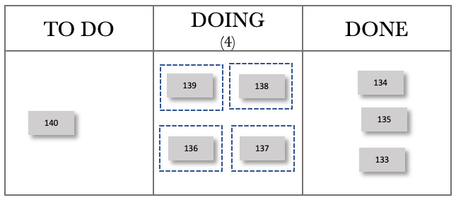
Fast-forwarding to the end of day 21, our board now looks like this. I have chosen to show only the completed work for the day in the DONE column to make it easier to see work movements.
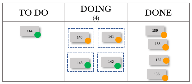
We have completed the four active tasks, and they were delivered with a lead time of 2 days. We could pull in tasks from the backlog and do so. Our WIP now contains two items on their second day of delivery and two on their first. The tracking now adds a focal point. As leaders, we should only get involved when necessary. Otherwise, the team can view us as micromanaging or interfering. In our daily team meeting, we can now focus our efforts on the work that is ‘red’. We can offer assistance if required or step back if the job is in hand and can be delivered on the day. Let’s fast forward to the end of day 22.
We were able to deliver three items and have one item that is red in our WIP. We ask the team if they are confident we will get it out the door in time. If there is any doubt, we need to offer assistance and do whatever we can to ensure that we deliver that item as a matter of priority.
Fast-forwarding to the end of day 23, our board now looks like this.
We can see that we have completed two requests, and they were delivered with a lead time of 2 and 3 days, respectively. We have three items in our WIP on their second day, and one on their first day. Let’s fast forward to the end of day 24.

We delivered two items on day 24 and had one in our WIP. We are starting to see a pattern. As we deliver on the higher end, four items a day, our board starts to turn ‘green’. If we deliver on the lower end, two on the day, the board begins to tend to amber and red. We are now getting instant feedback on our lead times.
Fast-forwarding to the end of day 25. The board now looks like this.

Day 25 was another excellent day for us. We managed to deliver four requests, pulling in two from our TO DO. Let’s look at one more day, fast-forwarding to the end of day 26.
You can see how lead time tracking can be used to track work flowing through the Kanban board.
We also see how variable capacity affects the output. Now let’s move to see how variable demand affects the output.
We have seen how variability brings along with it unpredictability. We have had a look at the situation where we kept the demand constant and varied our capacity. Let’s look now at the case where we vary the demand and keep our capacity steady. In this instance, we will assume that demand can vary between 2 and 4 per day, and our capacity is at 3 per day. The Kanban board below shows this. As per the previous example, we expect that things will even out over time.

The diagram above shows that we have an input of 2 to 4 requests per day. Our capacity is steady at three requests per day. Logic dictates that if we receive between 2 to 4 requests per day and can service three requests per day, we will meet our commitments over time. Given what we have seen previously, can we safely make this assumption? We need to run a few simulations to see the impact on the Output.
Variable demand is a fact of life. We all live with varying demands. Have we considered mapping out this demand in a graph? If we visualise our demand over time, we will start to gain insight into demand trends.
The control tools used alongside our Kanban board will provide us with much-needed insight.
Let’s walk through each control tool again to get a picture of what is going on when we vary demand and keep our capacity constant.
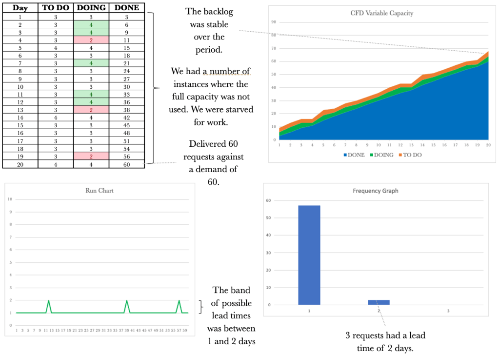
The table above shows our performance over 20 days. Let’s walk through the first day. Note I have added a DEMAND column to show the demand per day so we have full traceability across the table. On day 1, we received two requests (DEMAND) and added these to our TO DO column. We could service three requests and quickly deal with the demand for that day, and deliver the two requests. Day 1 exposed our available capacity for the day; these are highlighted in green, making them easy to see. On Day 2, we received four requests and added these 4 to our TO DO column. We could service three requests on this day, so one request remained in our TO DO column. Our output for the day was 3.
The table shows that we managed to deliver 56 requests over the period. As we have come to expect with variability, things do change. Let’s keep working through the other control tools.

The CFD shows a steady climb over the 20 days. The backlog or our TO DO varies in line with our variable demand. Our WIP remains at three unless we are starved for work, which happens in the latter stages of the simulation. Our output rose somewhat steadily to 56 over the 20 days. Let’s have a look at the Run Chart over the same period.

The Run Chart shows we had lead times of 1 or 2 days. Again the run chart shows us that our lead times will vary depending on the variable capacity. We see that not only varying capacity but also varying demand will affect lead times. Lead times grew as demand exceeded capacity. This view now shows the bands in which our lead times should fall to be considered normal.
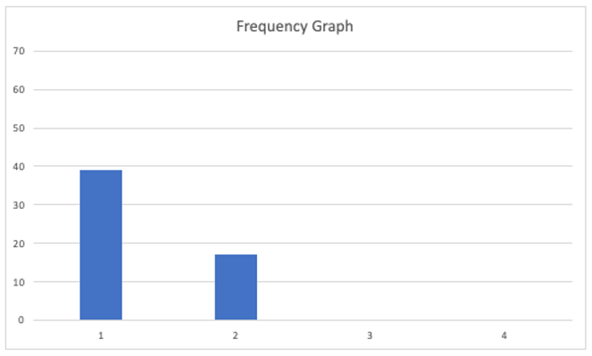
Let’s turn our attention to the Frequency Graph shown below. The graph shows that we delivered 39 requests with a one-day lead time and 17 with a two-day lead time.
Again, when dealing with variability, there can be many outcomes. We have looked at one example. Let’s have a look at a few more examples to gain an appreciation of how variable demand can affect our output.
At this stage, we may have just had the realisation that even though nothing changes in our delivery capacity from day to day, we still have inconsistencies in our lead times caused by variable demand.
Let’s have a look at another example.
And because with variability nothing stays the same, let’s look at one more run.

We have seen how variable demand and capacity affect our output. Let’s have a look at the run charts for both side by side.

The run charts above make it hard to say which set represents variable capacity and which collection represents variable demand. We took the ones on the left from the varying capacity simulations. We will find the same if we put the frequency charts next to one another.
Let’s have a look at the frequency graphs for both varying demand and varying capacity side by side.

Again it is hard to distinguish which set of frequency graphs represent which varying component. The ones on the left have varying capacity, and the ones on the right have variable demand. What is vital when viewing these tools side by side is realising that each contributes to telling a story. If a CFD is considered along with the Run Chart, this will give us a better picture. The complete picture reveals itself when we take the CFD, Run Chart and Frequency Graph and look at all of them together.
As we did previously, let’s look at how this plays out on our Kanban board. Let’s start with mapping the system out on our board.

From the above diagram, we see that we have a demand of 2 to 4 requests per day and a capacity of 3 per day. Let’s set up the board to represent this situation.
The Kanban board above shows that we have a capacity of 3, represented by the three boxes in the DOING column. We have set a WIP limit of 3 that represents our three team members. As previously, before we step through the day, let’s use last month’s data to help us with planning.
The Run Chart and Frequency diagrams below represent our performance over the last month. We will use this historical data to help us track work as it moves through the board.

The Run Chart shows that our lead times for the last month varied between 1 and 3 days, while the Frequency Graph shows that we delivered most of our requests on the second day. We will set up the traffic light system to label our tickets on the board using the standard Green, Amber, and Red system. We will put a green dot on any work added to the board. If the work remains on the board for the second day, we will replace the green dot with an amber one. If the job is still in place on the third day, we will label it with a red dot, as we did previously.

The Kanban Board below represents the situation on the 20th day. We will use a FIFO processing order, so tracking the work through the various stages is easier.

The board above shows that our team has pulled work from the TO DO column and all have something in progress. The board also shows that we have two items in our backlog.
Examining our previous month’s performance and knowing that our lead times vary between 1 and 3 days, we can now take our board and add tracking to the tickets. Keep in mind that we have a fixed capacity of 3 per day for this sequence and that our demand varies between 2 and 4 per day. The board at the end of day 21 is shown below.

Fast-forwarding to the end of day 22, our board now looks like this.
We received 3 new requests on day 22, have 3 requests in progress and have completed the 3 WIP from the previous day. The board below shows the end of day 23.

We received 4 new requests on day 23. We again produced 3 items per day in line with our capacity. Let’s work through a couple of more days.
Fast-forwarding to day 24, our board now looks like this.

We received two new requests on day 24, have 3 requests in progress and have completed the 3 WIP from the previous day. The board below shows day 25.
We received three new requests on day 25. We again produced three items per day in line with our capacity. We see the same pattern emerge as we did previously. Working your way through the days above will give you a sense of how we can track work coming in and see its progress against the lead time tolerance.
Trying to represent a dynamic and moving board pictorially at a set frequency cannot do justice, as the pictures are point-in-time representations. The images above should provide you with a reasonable basis from which to work and give you an idea of how you could visualise work flowing through the board, incorporating tracking with lead time visualisations.
We have seen how both a variable demand and variable capacity affects our output when taken one at a time. None of us is fortunate enough to have only variable demand or only fluctuating capacity. Usually, we are plagued by both. We need to work through the impact on output when both our demand and our capacity varies. Given what we have seen so far, we could assume chaos would ensue when we vary both. Variable capacity and demand will be more representative of our working lives, which we usually describe as chaotic.
Let’s draw out the system representation of our Kanban board.
The diagram above shows that we have a demand of 2 to 4 requests per day, and our capacity varies between 2 and 4 per day. As both dimensions vary, there is not much that we can infer from the expected behaviour at this point. We need to run a few simulations to see the impact on the Output.
Variable demand and variable capacity are a fact of life. We need to gain an appreciation of how variation affects Output. Using a Kanban board, collecting data and using the CFD, Run Chart, and Frequency diagram will provide us with the insight required to manage work despite varying demand and varying capacity.
Let’s delve into what would be more representative of what we face on a day-to-day basis.
Following the pattern of our previous examples, let’s walk through each control tool again to get a picture of what’s going on when we vary demand and capacity.

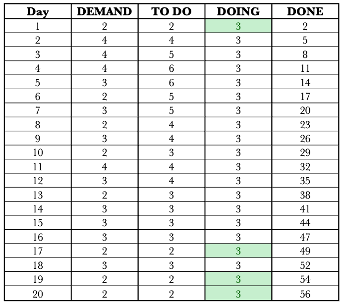
The table above shows our performance over 20 days. Let’s walk through the first day. Note I have added a DEMAND column to show the demand per day so we have full traceability across the table. On day 1, we received four requests (DEMAND) and added these to our TO DO column. We could service four requests, quickly deal with the demand for that day, and deliver all four requests. On Day 2, we received three requests and added these 3 to our TO DO column. On this day, we could service three requests and again were able to service all three requests. On Day 3, we received three requests and could service four. Day 3 exposed our available capacity for the day; these instances have been highlighted in green to make them easy to see. We only had one instance in which we had a capacity that exceeded demand for this simulation run.
The table shows that we managed to deliver 58 requests over the period. As we have come to expect with variability, things change. Let’s keep working through the other control tools to understand how variable capacity and demand affect our output.
The CFD shows a steady climb over the 20 days. The backlog, or the TO DO, varies in line with our variable demand. Our WIP also varies in line with the variable available capacity. Our output rose over the 20 days and now shows more variability when compared to our previous examples. Let’s have a look at the Run Chart over the same period.

The Run Chart shows we had lead times that varied between one and four days. The Run Chart shows the truly variable nature of the system and the unpredictability we face when both demand and capacity vary. Lead times again grew as demand exceeded capacity. This view now shows the bands in which our lead times should fall to be considered normal.
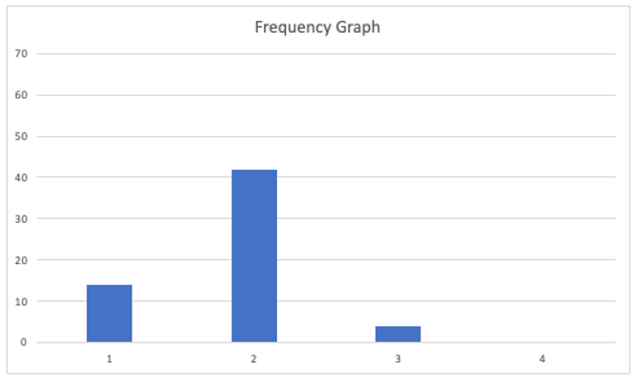
Turning our attention to the Frequency Graph below, the graph shows that we delivered 16 requests with a lead time of 1 day, 21 with a lead time of 2 days, 15 with a three-day lead time, and 6 with a four-day lead time.

Again, when dealing with variability, there can be many outcomes. We have looked at one example. Let’s have a look at a few more examples to gain an appreciation of how variable demand can affect our output.
Let’s have a look at another example.

As things vary, let’s look at one more.

Let’s see how this plays out on our Kanban board. Let’s start with mapping the system out on our board.
From the above diagram, we see that we have a varying demand of 2 to 4 requests per day and a varying capacity of 2 – 4 per day. Let’s set up the board to represent this situation.
The Kanban board above shows that we have a capacity of 4, represented by the four boxes in the DOING column. We have set a WIP limit of 4 that represents our four team members. As previously, before we step through the day, let’s use last month’s data to help us with planning.
The Run Chart and Frequency diagrams below represent our performance over the last month. We will use this historical data to help us track work as it moves through the board.

The Run Chart shows that our lead times for the last month varied between 1 and 4 days, while the Frequency Graph shows that we delivered most of our requests on the second day. We will set up the traffic light system to label our tickets on the board using the standard Green, Amber, and Red system. We will put a green dot on any work added to the board. If the work remains on the board for three days, we will replace the green dot with an amber one. If the job is still in place on the fourth day, we will label it with a red dot, as we did previously.

The Kanban Board below represents the situation on the 20th day. We will use a FIFO processing order so it is easier to track the work through the various stages.
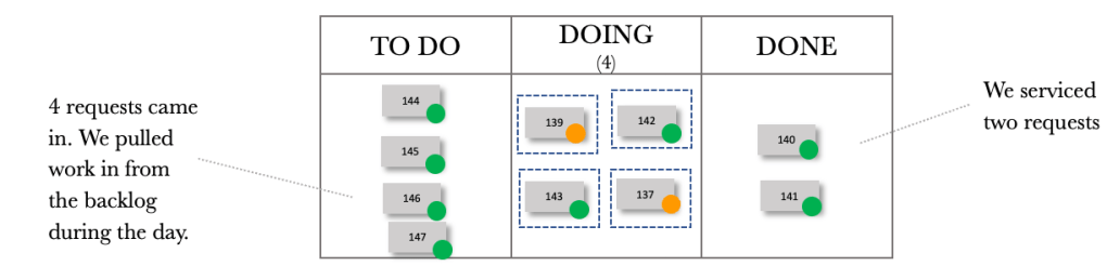
The board above shows that our team has pulled work from the TO DO column, and all have something in progress. The board also shows that we have one request in our backlog. At this stage, we have not added any tracking to the board.
Examining our previous month’s performance and knowing that our lead times vary between 1 and 4 days, we can now take our board and add tracking to the tickets. Keep in mind that for this sequence, we have varying demand and capacity. The board below shows the board at the end of day 21.

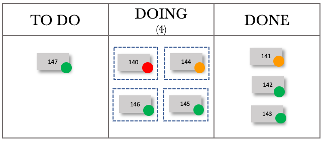
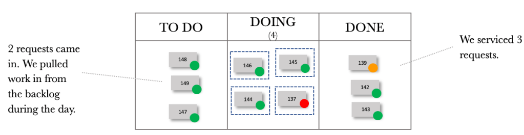
Fast-forwarding to the end of day 22.
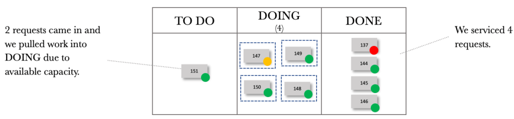
Fast-forwarding to the end of day 23.
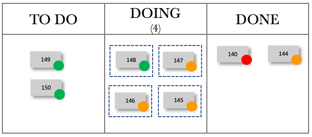
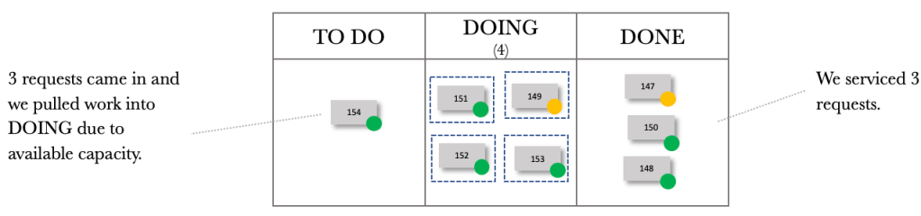
Fast-forwarding to the end of day 24.
Fast-forwarding to the end of day 25.
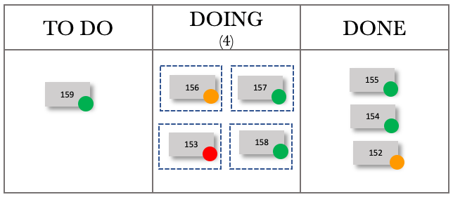
Fast-forwarding to the end of day 26.

We can now see the dynamic nature of our board with varying demand and capacity. Trying to manage just the board would prove to be complicated. Tracking tools allow us to see trends and monitor performance over time. Using the CFD, Run Chart and Frequency Diagram, we gain insight into what is happening with our board with varying demand and capacity.
We have gone through an introductory exploration of variability and will stop here. We have enough information to help us improve the flow of work through our Kanban Boards. Next, let’s look at dependency.
A PDF copy of the book can be found here: Unlocking the Power of Kanban
The physical copy of the book can be found here: Unlocking the Power of Kanban
