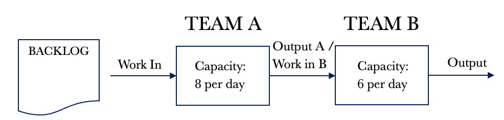
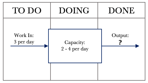
So far, we have considered a single-step system. Many of us receive work from upstream providers or teams and then pass work on for further processing. In this chapter, we will assume a situation where we are the manager of two groups Team A and Team B. Team A receives work and performs Part A of the job. When Part A is complete, Team A passes it to Team B, who carries out Part B. Once Part B is complete, the request is fulfilled, and no further processing is required.
For our illustration and exploration of dependency, we will ignore variability for the moment. We will bring both variability and dependency together in the next chapter. As we have done previously, let’s visualise our situation.
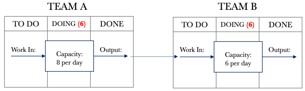
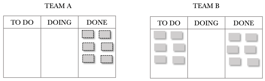
The diagram above shows that Team A can service eight requests per day and that Team B can service six requests per day. For our example, we will assume that demand exceeds capacity and that Team A will always be in a position to pull eight requests per day. With dependent Kanban boards, it is important to note that the DONE column feeds the TO DO column of the other. We could also represent the above situation on a single board, but for now, let’s consider them separate as this is a good way for us to visualise the effects of dependency.
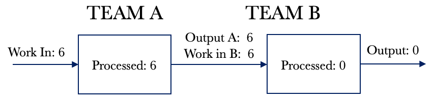
Let’s take a look at the system view of dependency. We will then work through the Kanban board. Using the example above, let’s draw out the system diagram.
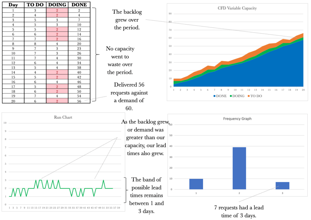
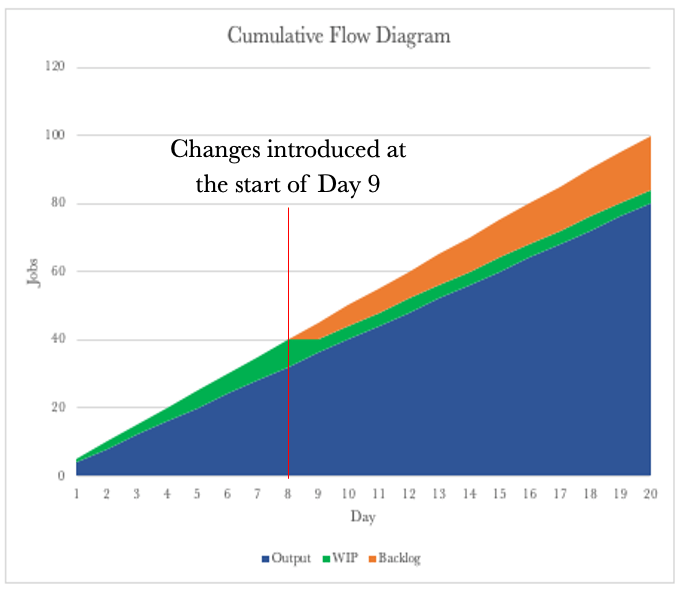
We have work that flows through the system, and the system has WIP that requires processing. Let’s look at a few days of processing for the above system with dependent events. I have added a backlog of activity to the diagram above. Currently, our demand exceeds our capacity, and we will assume we have 200 requests in the backlog to simplify tracking.
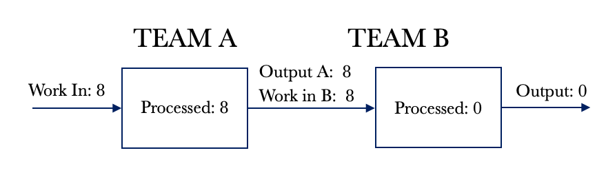
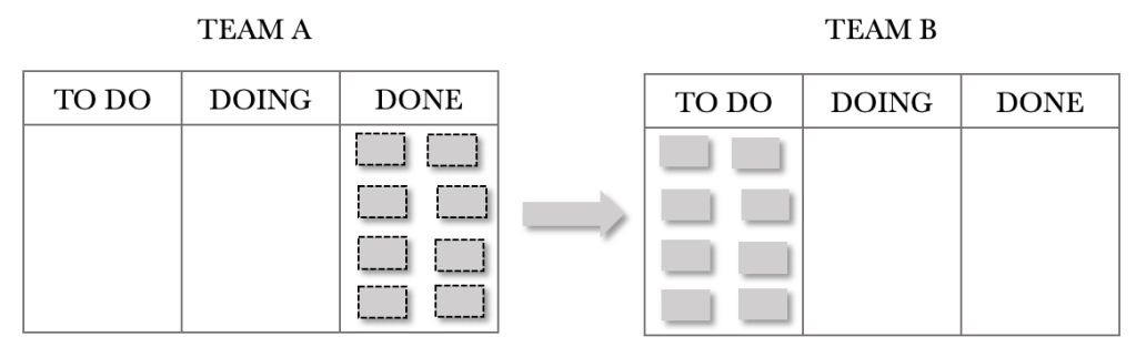
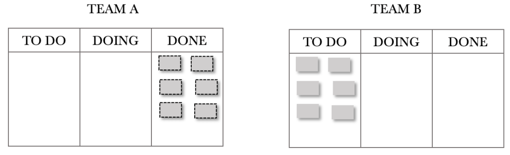
We will assume that the system is empty and that we are at day 1 of processing. For Day 1, Team A pulls eight requests from the backlog. It takes Team A a day to process their tasks, and at the end of the day, they complete eight requests. The partially completed requests are passed to Team B for processing. This flow is shown below.
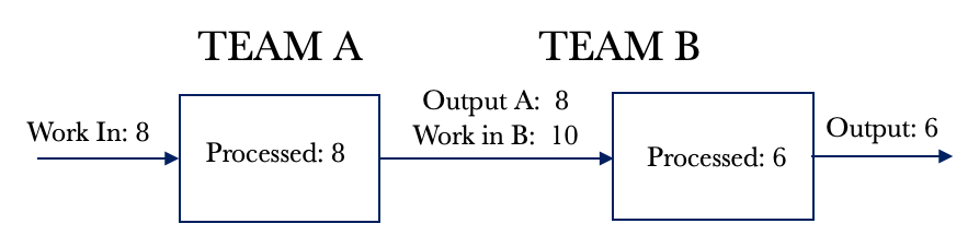
Look at Day 2 below. Team B pulls in 6 requests and fulfils these. We now have six fully serviced requests. Team A pulls another eight requests and completes their portion of the work. These requests are passed on to Team B for additional processing. We notice that the WIP for Team B has increased by 2 for the day.
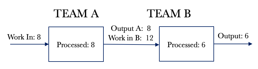
Let’s look at Day 3 below. Team B pulls in 6 requests and fulfils these as per Day 2. We now have another six fully serviced requests on Day 3. Team A pulls their eight daily requests and passes them on to Team B for additional processing. We that the WIP for Team B has increased by another 2.
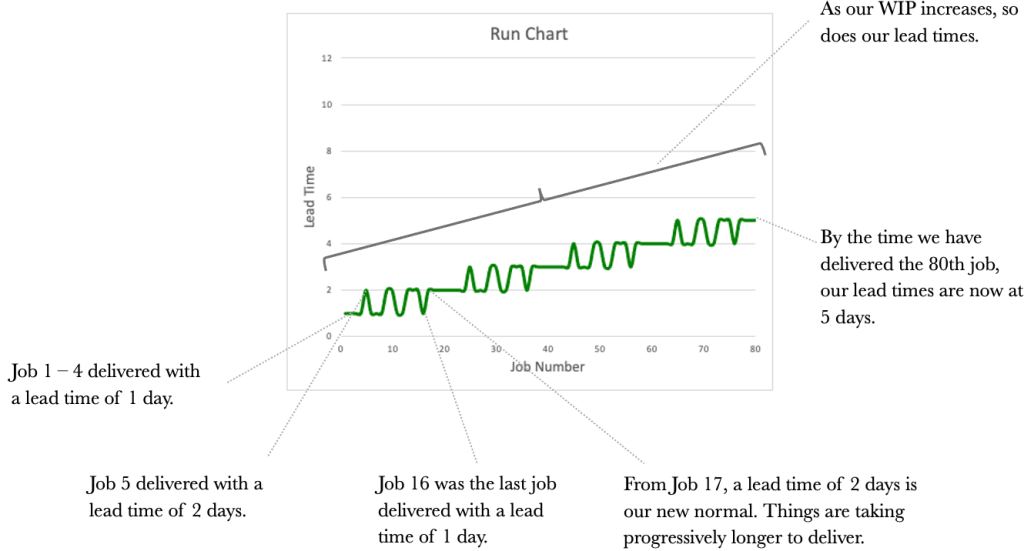
Looking at the situation above, we can see that we will fully service six requests every day we work. We will also increase our WIP by 2. We have already seen that an increase in WIP will increase cycle times. Our cycle times would continue to grow over time.
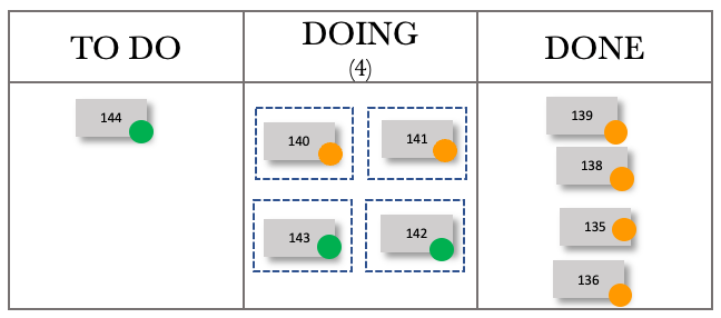
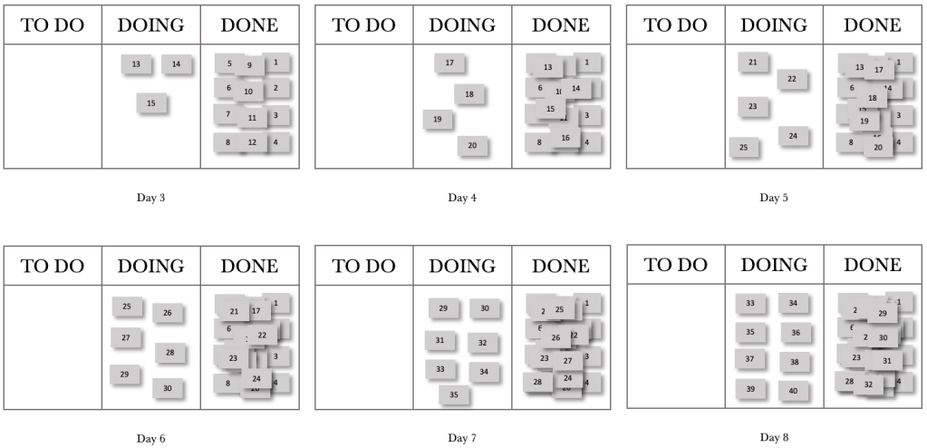
Let’s see how this plays out on the Kanban Boards. The sequence shows the first few days. For the illustration below, I have chosen not to show the 200 backlog items but instead decided to show the requests pulled through on the day. There are no requests shown in Team A’s TO DO because of this. Note that the board position shows the end of the day, so the tickets will appear in the DONE column. I want to convey the build-up of WIP we see in Team B’s TO DO. The end of Day 1 is shown below.
Team A and Team B’s boards above show that Team A completed their eight requests on Day one and passed these on to Team B. At the end of day 1, Team B now has eight requests in their TO DO that require final processing. They start on these requests the next day.
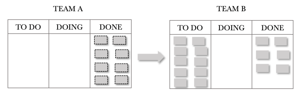
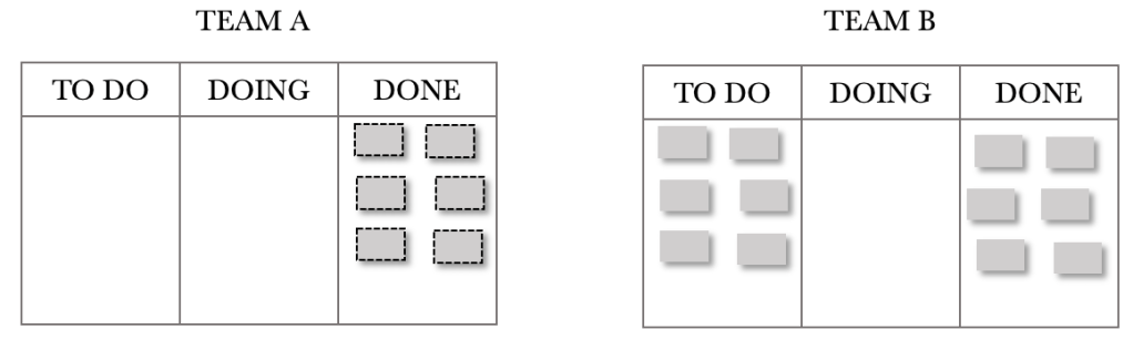
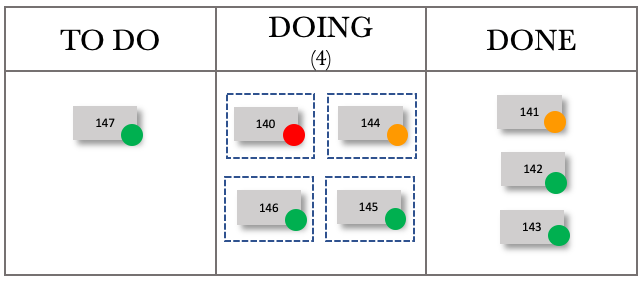
The end of Day 2 is shown below. Team A has completed another eight requests and passed these on to Team B for processing. Team B managed to complete six requests on the day. An important thing to note with dependent services is that items are finished when the last team has completed their task. The request is fulfilled once all processing for it is complete. We have so far completed six requests with a cycle time of 2 days.
Note how Team B’s TO DO has grown by two requests. When Team B starts day 3, they would already have increased their WIP by 2. Given what we learned about the link between WIP and cycle times, it is reasonable to expect that our cycle times will increase over time. Let’s have a look at day 3.
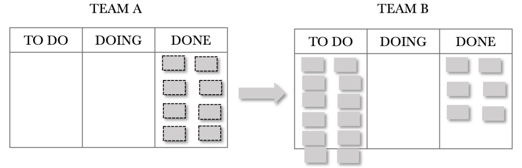
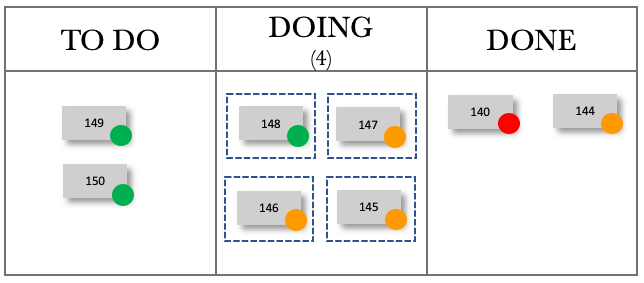
The end of Day 3 is shown below. There is no need to describe the situation in detail as it is a repeat of the previous day. The thing we need to note is the build-up of Team B’s TO DO.
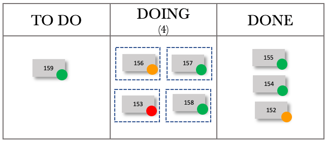
And at the end of day 4. Team B’s WIP continues to grow.
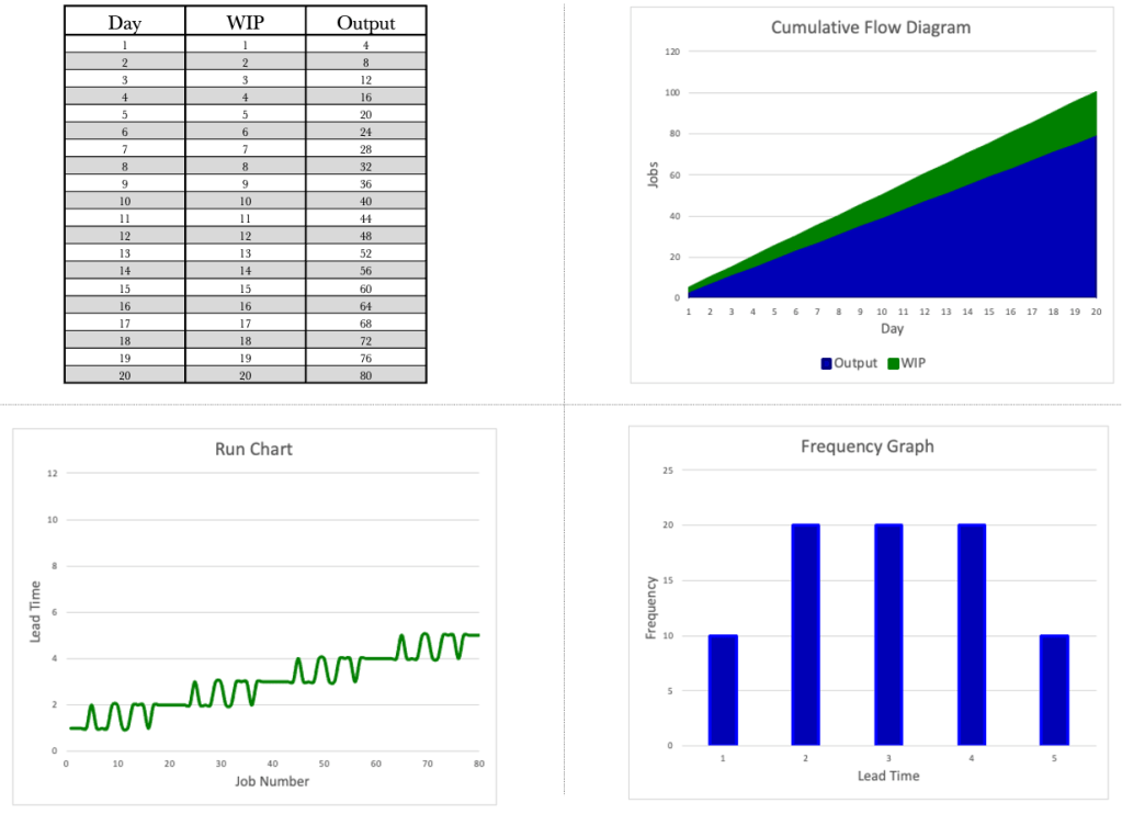
We have looked at the system view of dependency and have also looked at the Kanban boards. We have tools that can provide us with further insight. Let’s apply the CFD, Run Chart and Frequency Graph to our dependent service. Let’s take a look at our data table first.
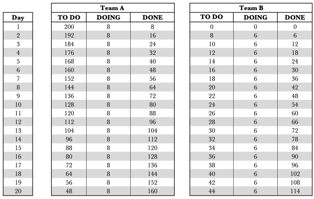
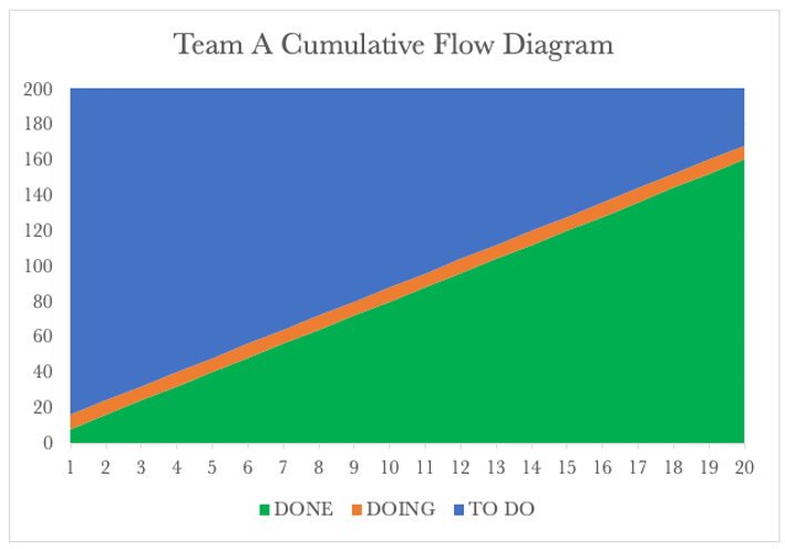
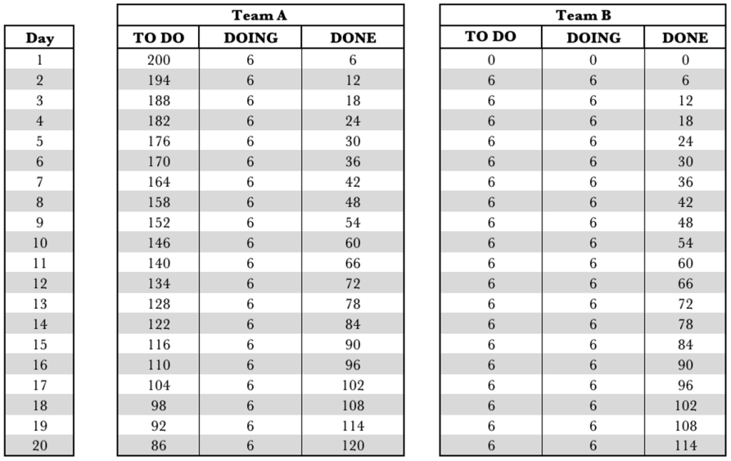
The table above shows Team B’s WIP growing by 2 per day. It also shows that over the 20 days, Team A completed 160 requests, and Team B completed 114 requests. Our overall performance for the end-to-end service was 114 requests fulfilled. With dependent systems, we have to look at the service as a whole. We cannot look at the individual performance of the components.
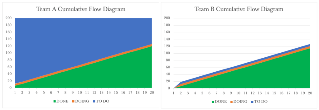
Below are the CFD’s for the two teams.
Team A’s CFD shows the burndown of the 200 requests over time. After 20 days, Team A has serviced 160 requests and passed these on to Team B.
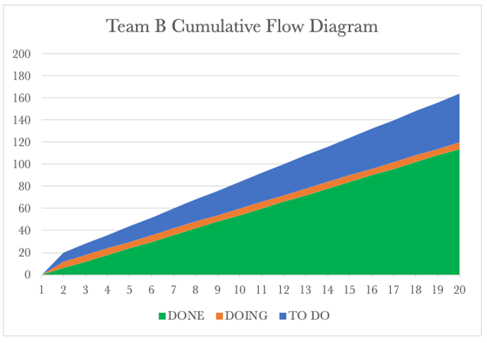
We know that for our service, Team B governs our fulfilment rate. Looking at the Team B CFD, we see a steady output of 6 requests per day. What we also see is the continued rise of Team B’s WIP. We know that each of our tools tells a story. Let’s have a look at the Run Charts for both next.
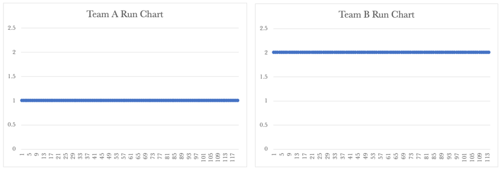
Below are the Run Charts for the two teams.
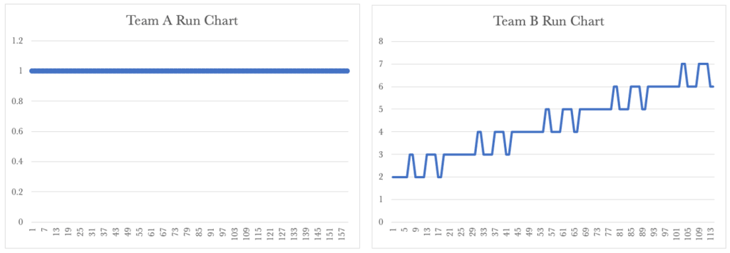
Team A’s Run Chart shows a steady cycle time of 1 day.
Team B’s run chart shows a rise in their cycle time over time. Team B’s performance governs our overall service performance, so our customers continue to see rising lead times over time. The Run Charts above show how important it is for us to take a global view of the service we provide.
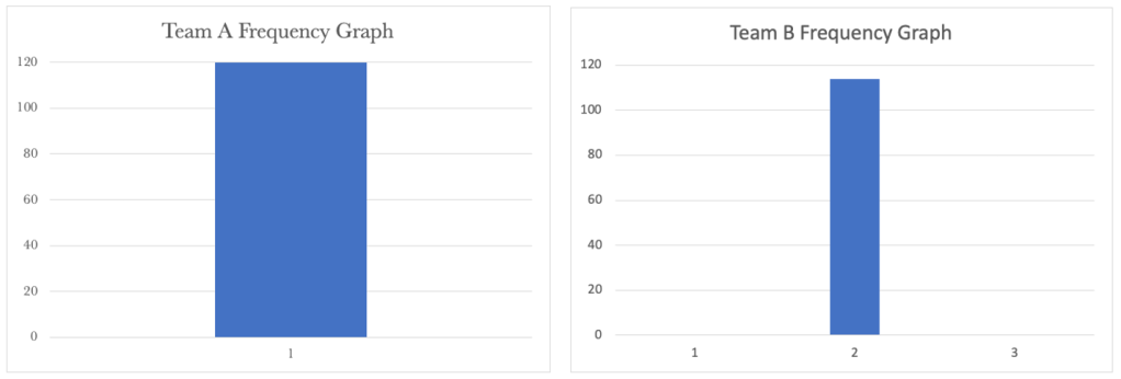
Let’s have a look at the Frequency Graphs for both next.
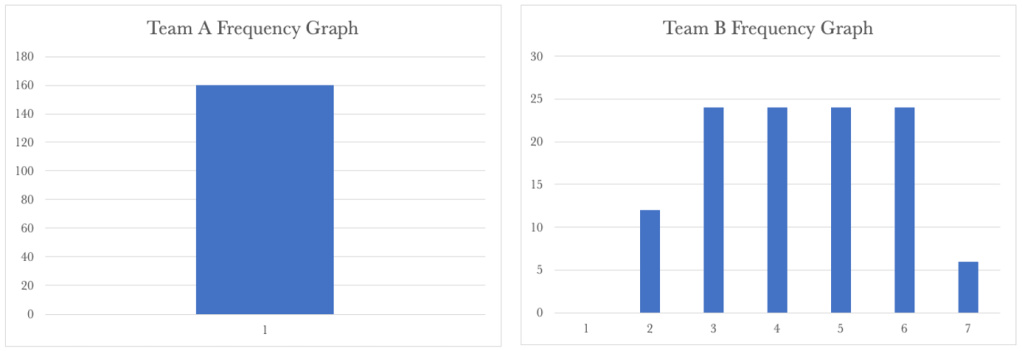
Team A’s Frequency Graph shows a steady cycle time of 1 day for their requests. Team B’s shows a wide distribution of frequency. So whilst we have part of our service stable, the other part of the service is spiralling out of control. Knowing that we need to look at the service as a whole, we have a situation that needs our attention.
Let’s have a look at how we tackle this next.
t’s go back to our Kanban boards. We had learned before that limiting WIP was essential to improve flow. We have seen above that if we limited WIP to the team’s capacity, overall, our cycle times would grow when we have dependent activities that have differing WIP limits. The important lesson here is that local optimisation may not lead to global improvements. Putting WIP limits locally, in our example, increased our cycle times. The other important lesson for us to note is that the constraint governs the output for the whole system. In our situation, the rate at which Team B can service requests governs the output for the system as a whole.
So how could we handle this situation? Mapping out the system shows that we have a constraint; Team B. One way to tackle our problem is to limit the WIP for both boards to 6, our constraint. You may initially get push back that this is unacceptable, as we will have people or resources that aren’t busy all the time. I would respond with, ‘Would you rather have longer cycle times and increased WIP or the ability to have due date predictability and improved performance?’
Let’s look at the Kanban boards below and put in a WIP limit aligned with our constraint.
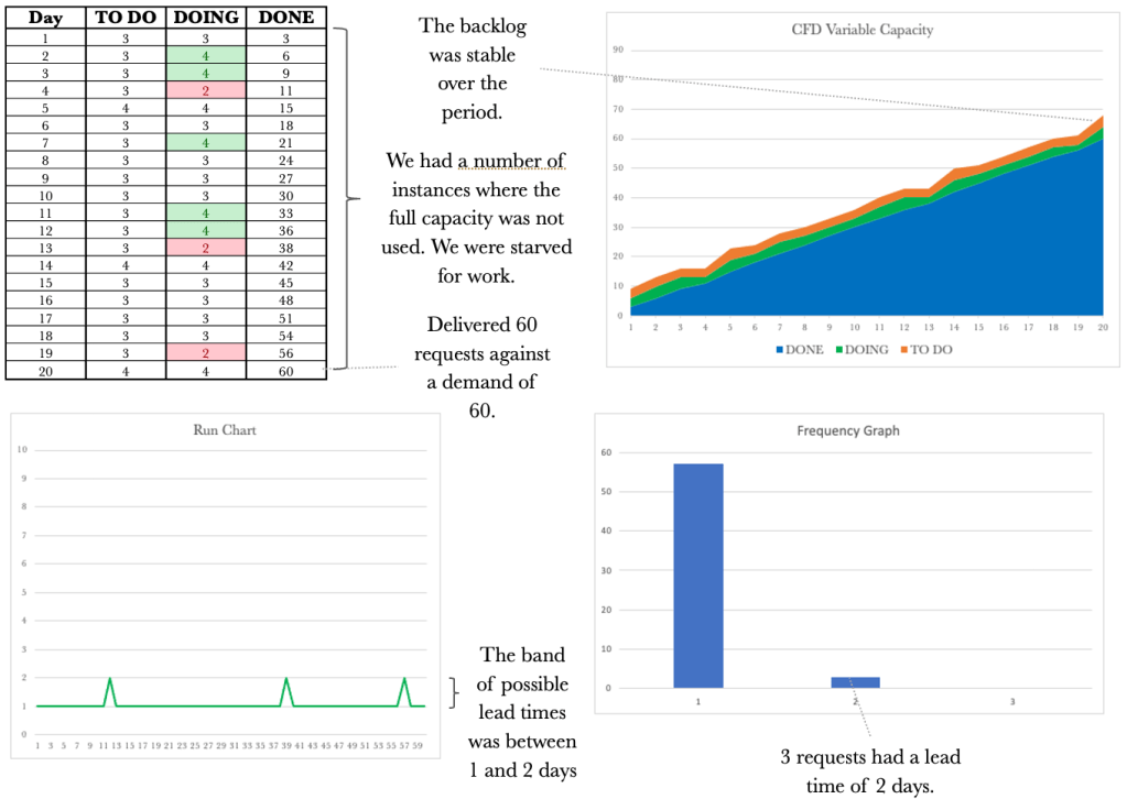
Let’s walk through the first three days with a balanced WIP limit and see how this compares to our previous example. We will again assume that the system is empty and that we are at day 1 of processing. For Day 1, Team A pulls six requests from the backlog even though the team can service eight requests. The WIP limit for Team A overrides their team capacity and governs how much work can be pulled. It takes Team A a day to process their six requests, and at the end of the day, they have completed all 6. Team A passes the six partially completed requests to Team B for processing. This flow is shown below.
On day 2, Team B pulls in 6 requests and processes them. These six requests are now considered complete. Team A pulls six requests from the backlog and process these for the day. On day 2, Team A has partially serviced six requests. The interesting thing to note here is that we don’t have a build-up of WIP and so will not have the corresponding increase in cycle times. We have balanced flow and not capacity. We now have a system through which work is flowing smoothly. The days that follow day 2 are the same as day 2.
Ensuring that we release work at the rate of our constraint is essential to balancing flow. We often receive work and then pass this on without any appreciation for the upstream or downstream WIP limits. We must ensure that we map the service end to end and then put a WIP limit that matches our constraint’s capacity.
The constraint, Team B in our case, should be considered the ‘Drum’ for the system. The Drum sets the pace at which we can service requests.
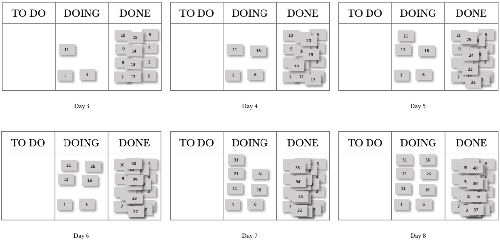
Let’s use our Kanban boards to map out the first few days. We will start again with an empty system and assume that we have 200 requests in our backlog. Again, I will not be showing the 200 requests on the boards to keep the diagrams clean. Let’s start with the end of day 1.
At the end of day 1, we see that Team A has processed six requests and passed these on to Team B for processing. Fast-forwarding to Day 2, shown below, we see that Team A processed another six requests for the day, and Team B has processed their 6.
On day 2, Team B pulls in 6 requests and processes them. These six requests are now considered complete. Team A pulls six requests from the backlog and process these for the day. On day 2, Team A has partially serviced six requests. The interesting thing to note here is that we don’t have a build-up of WIP and so will not have the corresponding increase in cycle times. We have balanced flow and not capacity. We now have a system through which work is flowing smoothly. The days that follow day 2 are the same as day 2.
Let’s take a look at day 3.
Day 3 looks exactly like day 2. There is no build-up of WIP, and our requests are still flowing smoothly through the dependent system.
Leveraging our control tools again, let’s see what is happening in the system.
Let’s apply the CFD, Run Chart and Frequency Graph to our dependent service that has been WIP-limited to the rate of the constraint. Let’s take a look at our data table first.
The table above shows Team B’s WIP remains constant. It also shows that over the 20 days, Team A completed 120 requests, and Team B completed 114 requests. Team B completes the same number of requests whether we limit the WIP for Team A to the constraint or not. Our overall performance for the service was 114 requests fulfilled. Just as before, our overall performance has not dropped.
Below are the CFD’s for the two teams.
Team A’s CFD shows the burndown of the 200 requests over time. After 20 days, Team A has serviced 120 requests and passed these on to Team B.
We know that for our service, Team B governs our output. Looking at the Team B CFD, we see a steady production of 6 requests per day. We also see that Team B’s WIP remains constant. Let’s look at the Run Charts next to see how this differs from the previous example.
Team A’s Run Chart shows a steady cycle time of 1 day.
Team B’s run chart now shows a steady cycle time. Team B’s performance governs our overall service performance, and now our customers experience a consistent delivery rate. The Run Charts above show how important it is for us to take a global view of our service and show that we have managed to get work flowing smoothly with consistent due-date delivery performance.
Let’s have a look at the Frequency Graphs for both next.
Team A’s Run Chart shows a steady cycle time of 1 day for their requests. Team B’s shows a constant frequency of 2 days. We now have a stable system, and work is flowing predictably. We can be confident that when Team A pulls work from the backlog, we will deliver it to the customer in two days.
Ensuring that we release work at the rate of our constraint is essential to balancing flow.
While we have made progress with dependent services, let’s look at what happens when we combine dependent services with variability.
So far, we have seen how work flows using constant values. Nothing we do is uniform. We have variability at every turn. The amount of work we receive daily is variable, and our demand varies. Our daily capacity varies as we have meetings to attend, go on leave for a well-deserved break or encounter issues we need to resolve. Despite all this variability, we still need to ensure that we maintain a constant flow of work through our department or team and maintain predictable delivery times.
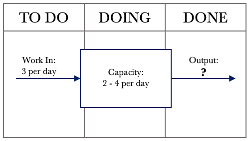
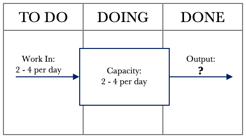
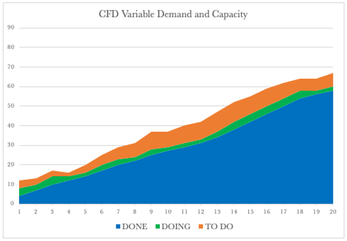
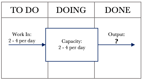
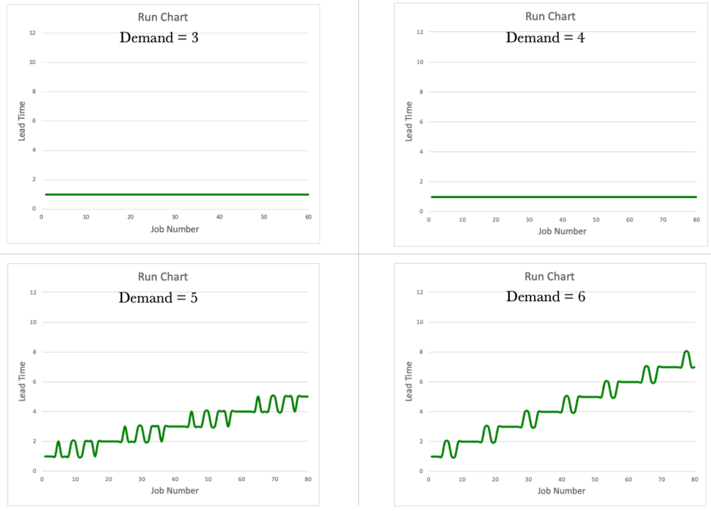
This chapter will focus on variability and show the effects that variability has on our work output. We use our systems diagram, which is representative of our Kanban board. Let’s examine the example below, where our daily capacity varies. We will assume a consistent demand of 3 per day and a variable capacity of between 2 and 4 per day. We can assume that things will level out over time, and we will meet our commitments.
The diagram above shows that we constantly input 3 requests per day. Our capacity to service requests varies between 2 and 4 requests per day. Logic dictates that if we receive three requests per day and can service between 2 – 4 requests per day, we will meet our commitments over time. Given that we can service between 2 – 4 requests per day, we need to see the impact on Output.
Many things can affect our capacity to service requests. Our days are not all uniform. We have administration tasks to tend to, issues to resolve, urgent requests that come in, and meetings. None of these items is standard. For instance, we could have one meeting for an hour on a given day and the next day have 7 hours of meetings. All this other work affects our ability to make full use of our capacity.
The tools we have used so far will give us a good picture of how our system behaves over time or how our Kanban board is performing. Our goal is to always ensure that we have work flowing as smoothly as possible. Let’s take a look at the data table over 20 days.
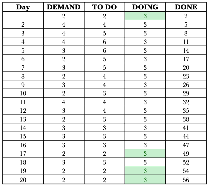
The table above shows our performance over 20 days. Let’s walk through the first day. On day 1, we received three requests, serviced all three and in line with that, our output was 3. It was a very stable day. On Day 2, we received three requests again. On this day, we could service four requests. For this day, our output was three, and the available capacity we could have used to service additional requests went unused. I have highlighted these situations in green so they are easy to see. On day 3, we again received three requests and were able to service only 2. Our output for that day was 2. In this instance, the demand for the day was greater than the available capacity. These situations are highlighted in red.
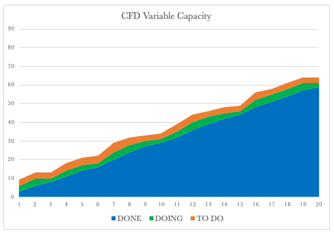
Overall we see that things balanced out as we first suspected. We managed to service 59 requests with a corresponding demand of 60. Not a bad performance, given we had variable capacity. Let’s have a look at the corresponding CFD.
The CFD shows a steady climb over the 20 days. The backlog or our TO DO remains relatively stable, and so does our WIP, and our delivery over time rose steadily. Let’s have a look at the Run Chart over the same period.
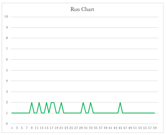
The Run Chart shows we had lead times of 1 or 2 days. The run chart shows that our lead times will vary depending on our available capacity. It also shows that we should expect that some of the work we have will be delivered in 2 days and some in one day. This view now shows the bands in which our lead times should fall to be considered normal.
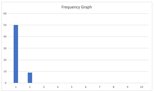
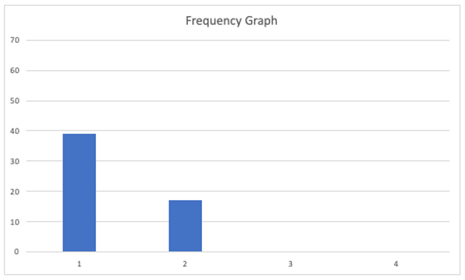
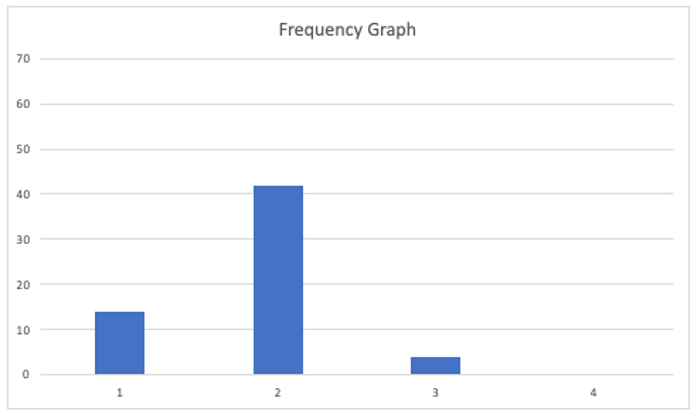
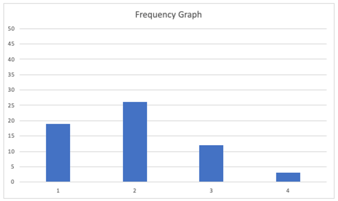
Let’s turn our attention to the Frequency Graph shown below. The graph shows that we delivered 50 requests with a one-day lead time and nine on the second day.
By collecting and presenting this data, we may be satisfied overall with our performance over the 20 days. Unfortunately, when dealing with variability, there can be many outcomes. We have looked at one that mostly mirrored our assumption that things would level out. We have already seen that with variable capacity, there are times when some of our capacity goes unused. We refer to this situation as ‘being starved for work’. We have also seen that there are times when we are unable to service demand, and our backlog grows. We refer to this situation as ‘being overburdened’.
Over the following few pages, we will look at more runs of the simulation to gain further insight into the effect of variability. We will consider the table and the CFD together and then the Run Chart and Frequency Graph together. We will keep the demand constant at three and vary our capacity between 2 and 4.
Below is the output from another run of the simulation. We will again be able to see differences between the previous runs.
Let’s have a look at one more run before we move on.
Let’s take one of the runs and use the data to inform our Kanban board. Let’s start with mapping the system out on our board.
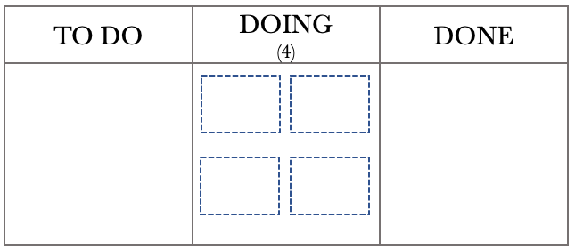
From the above diagram, we see that we can deliver between 2 and 4 requests per day. Let’s develop our scenario further and assume that we are the leader of a team of 4. Each team member services one request per day. Sometimes individuals are caught up with administrative matters, issue resolution or may be absent from work. All of this affects our daily output. Let’s set up the board to represent this situation.
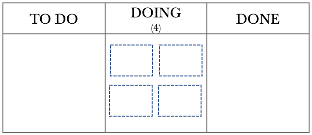
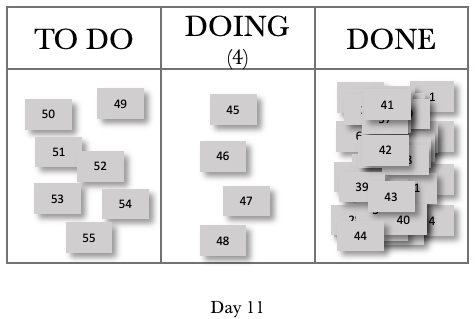
The Kanban board above shows that we have a team of 4, represented by the four boxes in the DOING column, and a WIP limit of 4. With a WIP limit of 4 and 4 team members, we effectively have a WIP limit of 1 per person. Individual team members will pull from the TO DO column when they have completed the task. We have chosen this configuration to help with minimising multitasking. Before we step through the day, let’s use the previous month’s data to help us with planning.
The Run Chart and Frequency diagrams below represent our performance over the last month. We will use this historical data to help us track work as it moves through the board.
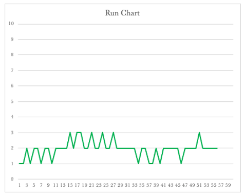
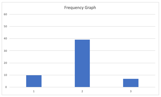
The Run Chart shows that our lead times for the last month varied between 1 and 3 days, while the Frequency Graph shows that we delivered most of our requests on the second day. This is beneficial information that we can incorporate into our board to give us a real-time performance on how we are tracking. The first thing we need to do is to set up a traffic light system to label our tickets on the board. Using the standard Green, Amber, and Red system, we will put a green dot on any work added to the board. If the work remains on the board for the second day, we will replace the green dot with an amber one. If the job is still in place on the third day, we will label it with a red dot.
The Kanban Board below represents the close of play on the 20th day. We will use a FIFO processing order so it is easier for us to track the work through the various stages.
The board above shows that each team member has pulled work from the TO DO column, and all have something in progress. The board also shows that we have two items in our backlog. We need to note that with our WIP limit of 4, our team will always be working on something. Their ability to complete their assigned work on the day is affected by the amount of other activity they have on that particular day.
Examining our previous month’s performance and knowing that our lead times vary between 1 and 3 days, we can now take our board and add tracking to the tickets. We add amber dots to the tickets to show they are on their second activity day. The board at the start of day 21 with tracking is below.
Fast-forwarding to the end of day 21, our board now looks like this. I have chosen to show only the completed work for the day in the DONE column to make it easier to see work movements.
We have completed the four active tasks, and they were delivered with a lead time of 2 days. We could pull in tasks from the backlog and do so. Our WIP now contains two items on their second day of delivery and two on their first. The tracking now adds a focal point. As leaders, we should only get involved when necessary. Otherwise, the team can view us as micromanaging or interfering. In our daily team meeting, we can now focus our efforts on the work that is ‘red’. We can offer assistance if required or step back if the job is in hand and can be delivered on the day. Let’s fast forward to the end of day 22.
We were able to deliver three items and have one item that is red in our WIP. We ask the team if they are confident we will get it out the door in time. If there is any doubt, we need to offer assistance and do whatever we can to ensure that we deliver that item as a matter of priority.
Fast-forwarding to the end of day 23, our board now looks like this.
We can see that we have completed two requests, and they were delivered with a lead time of 2 and 3 days, respectively. We have three items in our WIP on their second day, and one on their first day. Let’s fast forward to the end of day 24.
We delivered two items on day 24 and had one in our WIP. We are starting to see a pattern. As we deliver on the higher end, four items a day, our board starts to turn ‘green’. If we deliver on the lower end, two on the day, the board begins to tend to amber and red. We are now getting instant feedback on our lead times.
Fast-forwarding to the end of day 25. The board now looks like this.
Day 25 was another excellent day for us. We managed to deliver four requests, pulling in two from our TO DO. Let’s look at one more day, fast-forwarding to the end of day 26.
You can see how lead time tracking can be used to track work flowing through the Kanban board.
We also see how variable capacity affects the output. Now let’s move to see how variable demand affects the output.
We have seen how variability brings along with it unpredictability. We have had a look at the situation where we kept the demand constant and varied our capacity. Let’s look now at the case where we vary the demand and keep our capacity steady. In this instance, we will assume that demand can vary between 2 and 4 per day, and our capacity is at 3 per day. The Kanban board below shows this. As per the previous example, we expect that things will even out over time.
The diagram above shows that we have an input of 2 to 4 requests per day. Our capacity is steady at three requests per day. Logic dictates that if we receive between 2 to 4 requests per day and can service three requests per day, we will meet our commitments over time. Given what we have seen previously, can we safely make this assumption? We need to run a few simulations to see the impact on the Output.
Variable demand is a fact of life. We all live with varying demands. Have we considered mapping out this demand in a graph? If we visualise our demand over time, we will start to gain insight into demand trends.
The control tools used alongside our Kanban board will provide us with much-needed insight.
Let’s walk through each control tool again to get a picture of what is going on when we vary demand and keep our capacity constant.
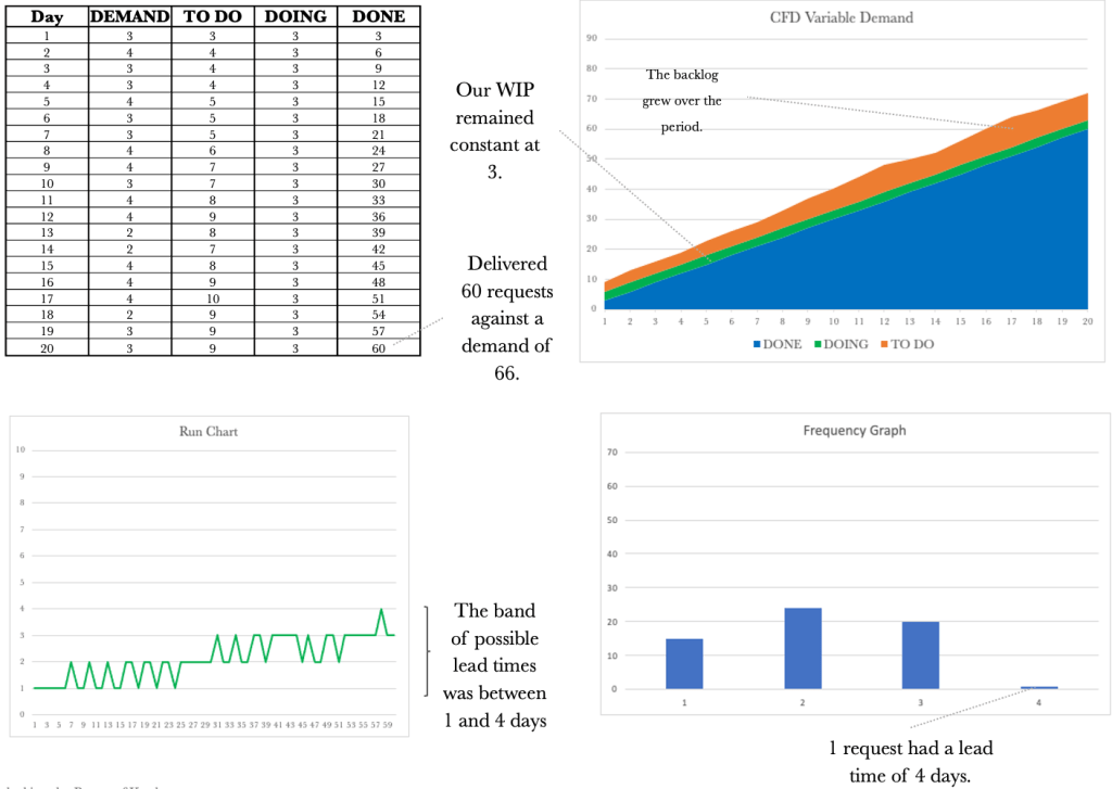
The table above shows our performance over 20 days. Let’s walk through the first day. Note I have added a DEMAND column to show the demand per day so we have full traceability across the table. On day 1, we received two requests (DEMAND) and added these to our TO DO column. We could service three requests and quickly deal with the demand for that day, and deliver the two requests. Day 1 exposed our available capacity for the day; these are highlighted in green, making them easy to see. On Day 2, we received four requests and added these 4 to our TO DO column. We could service three requests on this day, so one request remained in our TO DO column. Our output for the day was 3.
The table shows that we managed to deliver 56 requests over the period. As we have come to expect with variability, things do change. Let’s keep working through the other control tools.
The CFD shows a steady climb over the 20 days. The backlog or our TO DO varies in line with our variable demand. Our WIP remains at three unless we are starved for work, which happens in the latter stages of the simulation. Our output rose somewhat steadily to 56 over the 20 days. Let’s have a look at the Run Chart over the same period.
The Run Chart shows we had lead times of 1 or 2 days. Again the run chart shows us that our lead times will vary depending on the variable capacity. We see that not only varying capacity but also varying demand will affect lead times. Lead times grew as demand exceeded capacity. This view now shows the bands in which our lead times should fall to be considered normal.
Let’s turn our attention to the Frequency Graph shown below. The graph shows that we delivered 39 requests with a one-day lead time and 17 with a two-day lead time.
Again, when dealing with variability, there can be many outcomes. We have looked at one example. Let’s have a look at a few more examples to gain an appreciation of how variable demand can affect our output.
At this stage, we may have just had the realisation that even though nothing changes in our delivery capacity from day to day, we still have inconsistencies in our lead times caused by variable demand.
Let’s have a look at another example.
And because with variability nothing stays the same, let’s look at one more run.
We have seen how variable demand and capacity affect our output. Let’s have a look at the run charts for both side by side.
The run charts above make it hard to say which set represents variable capacity and which collection represents variable demand. We took the ones on the left from the varying capacity simulations. We will find the same if we put the frequency charts next to one another.
Let’s have a look at the frequency graphs for both varying demand and varying capacity side by side.
Again it is hard to distinguish which set of frequency graphs represent which varying component. The ones on the left have varying capacity, and the ones on the right have variable demand. What is vital when viewing these tools side by side is realising that each contributes to telling a story. If a CFD is considered along with the Run Chart, this will give us a better picture. The complete picture reveals itself when we take the CFD, Run Chart and Frequency Graph and look at all of them together.
As we did previously, let’s look at how this plays out on our Kanban board. Let’s start with mapping the system out on our board.
From the above diagram, we see that we have a demand of 2 to 4 requests per day and a capacity of 3 per day. Let’s set up the board to represent this situation.
The Kanban board above shows that we have a capacity of 3, represented by the three boxes in the DOING column. We have set a WIP limit of 3 that represents our three team members. As previously, before we step through the day, let’s use last month’s data to help us with planning.
The Run Chart and Frequency diagrams below represent our performance over the last month. We will use this historical data to help us track work as it moves through the board.
The Run Chart shows that our lead times for the last month varied between 1 and 3 days, while the Frequency Graph shows that we delivered most of our requests on the second day. We will set up the traffic light system to label our tickets on the board using the standard Green, Amber, and Red system. We will put a green dot on any work added to the board. If the work remains on the board for the second day, we will replace the green dot with an amber one. If the job is still in place on the third day, we will label it with a red dot, as we did previously.
The Kanban Board below represents the situation on the 20th day. We will use a FIFO processing order, so tracking the work through the various stages is easier.
The board above shows that our team has pulled work from the TO DO column and all have something in progress. The board also shows that we have two items in our backlog.
Examining our previous month’s performance and knowing that our lead times vary between 1 and 3 days, we can now take our board and add tracking to the tickets. Keep in mind that we have a fixed capacity of 3 per day for this sequence and that our demand varies between 2 and 4 per day. The board at the end of day 21 is shown below.
Fast-forwarding to the end of day 22, our board now looks like this.
We received 3 new requests on day 22, have 3 requests in progress and have completed the 3 WIP from the previous day. The board below shows the end of day 23.
We received 4 new requests on day 23. We again produced 3 items per day in line with our capacity. Let’s work through a couple of more days.
Fast-forwarding to day 24, our board now looks like this.
We received two new requests on day 24, have 3 requests in progress and have completed the 3 WIP from the previous day. The board below shows day 25.
We received three new requests on day 25. We again produced three items per day in line with our capacity. We see the same pattern emerge as we did previously. Working your way through the days above will give you a sense of how we can track work coming in and see its progress against the lead time tolerance.
Trying to represent a dynamic and moving board pictorially at a set frequency cannot do justice, as the pictures are point-in-time representations. The images above should provide you with a reasonable basis from which to work and give you an idea of how you could visualise work flowing through the board, incorporating tracking with lead time visualisations.
We have seen how both a variable demand and variable capacity affects our output when taken one at a time. None of us is fortunate enough to have only variable demand or only fluctuating capacity. Usually, we are plagued by both. We need to work through the impact on output when both our demand and our capacity varies. Given what we have seen so far, we could assume chaos would ensue when we vary both. Variable capacity and demand will be more representative of our working lives, which we usually describe as chaotic.
Let’s draw out the system representation of our Kanban board.
The diagram above shows that we have a demand of 2 to 4 requests per day, and our capacity varies between 2 and 4 per day. As both dimensions vary, there is not much that we can infer from the expected behaviour at this point. We need to run a few simulations to see the impact on the Output.
Variable demand and variable capacity are a fact of life. We need to gain an appreciation of how variation affects Output. Using a Kanban board, collecting data and using the CFD, Run Chart, and Frequency diagram will provide us with the insight required to manage work despite varying demand and varying capacity.
Let’s delve into what would be more representative of what we face on a day-to-day basis.
Following the pattern of our previous examples, let’s walk through each control tool again to get a picture of what’s going on when we vary demand and capacity.
The table above shows our performance over 20 days. Let’s walk through the first day. Note I have added a DEMAND column to show the demand per day so we have full traceability across the table. On day 1, we received four requests (DEMAND) and added these to our TO DO column. We could service four requests, quickly deal with the demand for that day, and deliver all four requests. On Day 2, we received three requests and added these 3 to our TO DO column. On this day, we could service three requests and again were able to service all three requests. On Day 3, we received three requests and could service four. Day 3 exposed our available capacity for the day; these instances have been highlighted in green to make them easy to see. We only had one instance in which we had a capacity that exceeded demand for this simulation run.
The table shows that we managed to deliver 58 requests over the period. As we have come to expect with variability, things change. Let’s keep working through the other control tools to understand how variable capacity and demand affect our output.
The CFD shows a steady climb over the 20 days. The backlog, or the TO DO, varies in line with our variable demand. Our WIP also varies in line with the variable available capacity. Our output rose over the 20 days and now shows more variability when compared to our previous examples. Let’s have a look at the Run Chart over the same period.
The Run Chart shows we had lead times that varied between one and four days. The Run Chart shows the truly variable nature of the system and the unpredictability we face when both demand and capacity vary. Lead times again grew as demand exceeded capacity. This view now shows the bands in which our lead times should fall to be considered normal.
Turning our attention to the Frequency Graph below, the graph shows that we delivered 16 requests with a lead time of 1 day, 21 with a lead time of 2 days, 15 with a three-day lead time, and 6 with a four-day lead time.
Again, when dealing with variability, there can be many outcomes. We have looked at one example. Let’s have a look at a few more examples to gain an appreciation of how variable demand can affect our output.
Let’s have a look at another example.
As things vary, let’s look at one more.
Let’s see how this plays out on our Kanban board. Let’s start with mapping the system out on our board.
From the above diagram, we see that we have a varying demand of 2 to 4 requests per day and a varying capacity of 2 – 4 per day. Let’s set up the board to represent this situation.
The Kanban board above shows that we have a capacity of 4, represented by the four boxes in the DOING column. We have set a WIP limit of 4 that represents our four team members. As previously, before we step through the day, let’s use last month’s data to help us with planning.
The Run Chart and Frequency diagrams below represent our performance over the last month. We will use this historical data to help us track work as it moves through the board.
The Run Chart shows that our lead times for the last month varied between 1 and 4 days, while the Frequency Graph shows that we delivered most of our requests on the second day. We will set up the traffic light system to label our tickets on the board using the standard Green, Amber, and Red system. We will put a green dot on any work added to the board. If the work remains on the board for three days, we will replace the green dot with an amber one. If the job is still in place on the fourth day, we will label it with a red dot, as we did previously.
The Kanban Board below represents the situation on the 20th day. We will use a FIFO processing order so it is easier to track the work through the various stages.
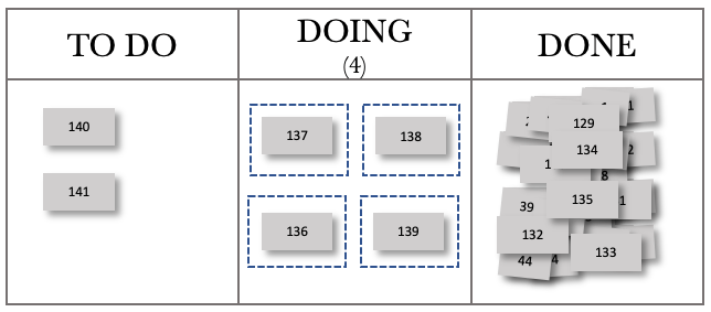
The board above shows that our team has pulled work from the TO DO column, and all have something in progress. The board also shows that we have one request in our backlog. At this stage, we have not added any tracking to the board.
Examining our previous month’s performance and knowing that our lead times vary between 1 and 4 days, we can now take our board and add tracking to the tickets. Keep in mind that for this sequence, we have varying demand and capacity. The board below shows the board at the end of day 21.
Fast-forwarding to the end of day 22.
Fast-forwarding to the end of day 23.
Fast-forwarding to the end of day 24.
Fast-forwarding to the end of day 25.
Fast-forwarding to the end of day 26.
We can now see the dynamic nature of our board with varying demand and capacity. Trying to manage just the board would prove to be complicated. Tracking tools allow us to see trends and monitor performance over time. Using the CFD, Run Chart and Frequency Diagram, we gain insight into what is happening with our board with varying demand and capacity.
We have gone through an introductory exploration of variability and will stop here. We have enough information to help us improve the flow of work through our Kanban Boards. Next, let’s look at dependency.
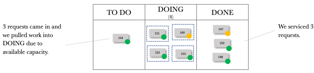
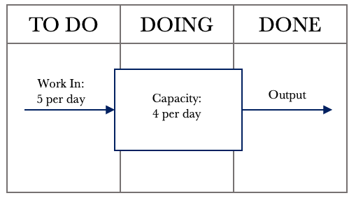
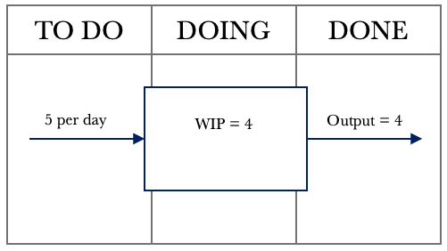
We’ll start our exploration with some basic flow principles. Consider a situation where you are managing a team. This team is capable of servicing four requests per day. Requests are received at the start of the day, and the team processes them in the order received.
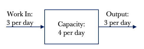
The team is part of a start-up, and while they can service four requests per day, currently, the company only receives three requests a day. Let’s take a look at the system diagram below that illustrates our situation.
The diagram above shows that we have an input of 3 requests per day. We also have the capacity to service four requests per day. Logic dictates that if we receive three requests per day and can service four requests per day, we will have an output of 3 requests per day. In other words, we can service every request received as our capacity exceeds demand. The demand placed on the team is three requests per day. Work In Progress is a term we use to denote how much active work we have. In this example, our Work In Progress or WIP is zero. We do not have any WIP at the end of the day as we have serviced all requests, and no leftover work is pushed into the next day.
*Note: I use the words jobs and requests interchangeably. They mean the same thing in the context of making work flow.
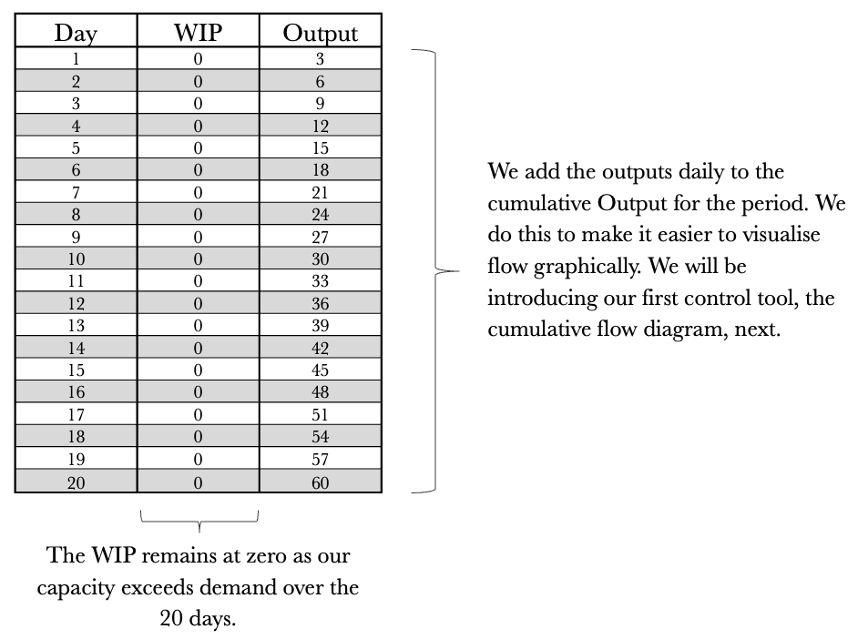
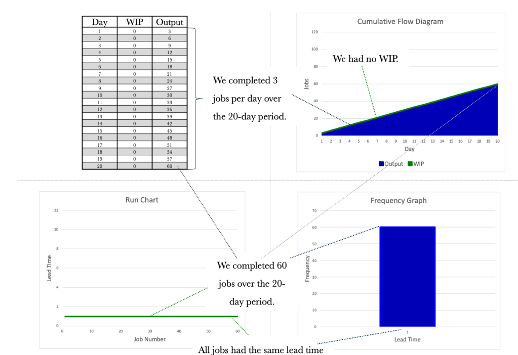
Let’s take a look at the situation over 20 days. The table below shows the day, the WIP and the Output per day. We know that we have a demand of 3 per day and a capacity of 4 per day.
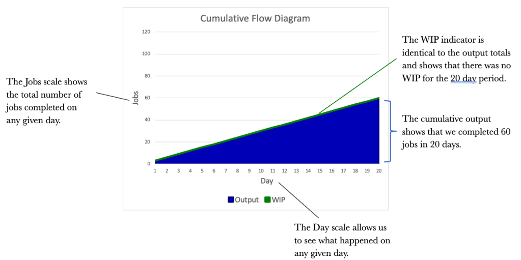
While the table provides us with the base data and is a good reference for analysis, we need to visualise the data so that we can get a feel for what’s happening at a glance. Visualising flow is where the Cumulative Flow Diagram (CFD) comes in. Let’s map out the CFD using the previous table.
When graphing the CFD, we always want to start with the output as the first series and then build backwards from there. For instance, if our Kanban board has a TO DO, DOING and DONE column, we would graph the CFD starting with the DONE column, the DOING column, and finally, the TO DO column. The cumulative total of completed work is what gives the tool its structure.
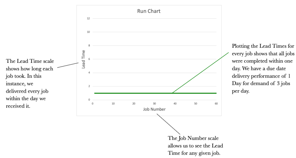
The CFD is an excellent way of visualising flow over time. We should not underestimate its power as a communication tool. While the CFD provides a good flow view, it would also be good to see how each job performed and how long each took. This is where the Run Chart comes in. It would be good to know how long it took us to complete every job that we had. Staying with our three jobs per day theme, let’s introduce a Run Chart to the mix.
We will look at a Run Chart for the 20-day period that dovetails our CFD and the original table.
We now have the Table, the CFD and the Run Chart. We will round out our control tools with one more graph. This is the Frequency Graph. The Frequency Graph shows us how many items were delivered with the same lead time. Again using our example of demand of 3 per day, let’s look at a Frequency Graph.
The 4 tools used together provide us with a complete picture of how our work is flowing. Let’s take a look at them all together and see if we can tell a story just by reviewing the tools and with no context provided.
The tools all tie together and provide us with differing views of how work is flowing. The tools may seem redundant at this stage, but I assure you they will offer you valuable insight as we progress. The important thing for us is to know that the tools exist and to use them to garner insightful information.
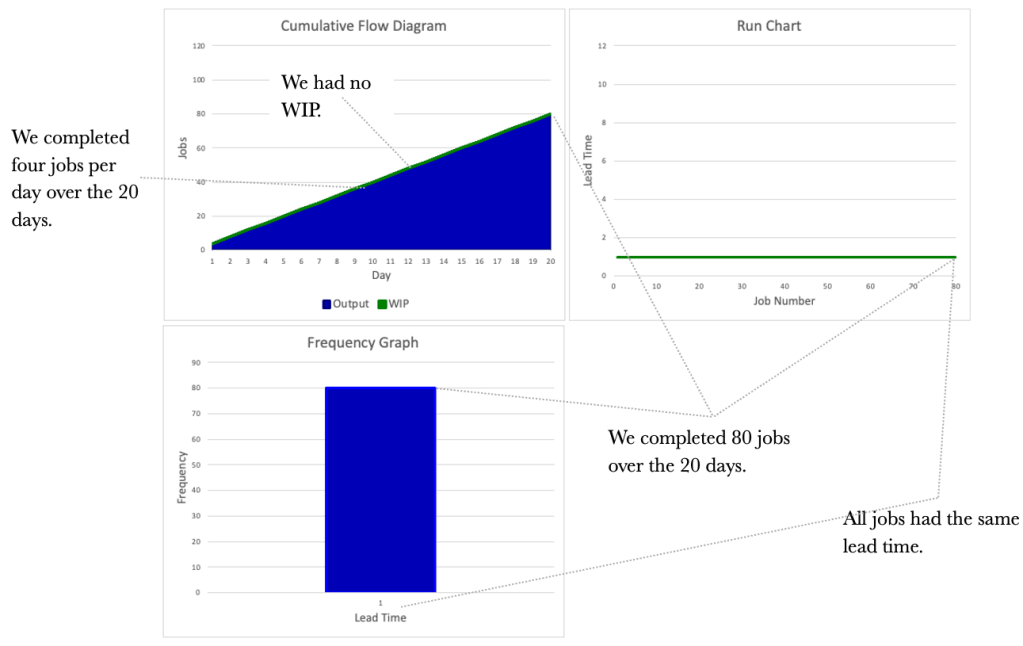
Let’s consider the situation below. We have increased demand to 4 per day and kept capacity at 4 per day. Again, logic dictates that if we receive four requests a day and can service four per day, our output will be four per day.
Again, we see no WIP, as we can service all requests on the day they are received. The table below shows the flow over 20 days. Note that our output increased in line with our input as we had the capacity to deal with the increase.
Let’s turn to the three diagrammatical tools and see what information we can glean from them.
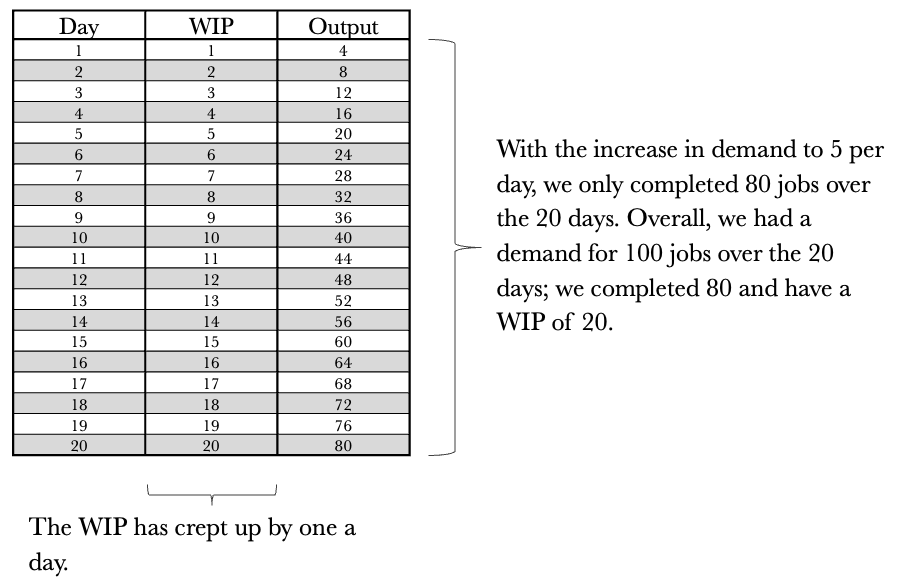
So far, we have considered a couple of simple situations where demand is less than or equal to capacity. What if demand exceeded capacity? A demand that exceeds capacity is closer to reality for most of us. Let’s increase the demand to 5 per day while keeping our capacity at 4 per day. The first step is to draw the system representation of the situation we face.
We now notice something interesting. Our demand has increased to 5 per day, but our output has remained at 4 per day. A demand exceeding capacity is a common phenomenon and something we must keep in mind as we progress. We cannot deliver more than we can produce. In this case, our capacity is constrained to 4 per day. We can push as much work as we want into the system, but it will only produce 4 per day. Our team is known as a Capacity Constrained Resource (CCR) in this situation. We are constrained to completing 4 jobs per day. Let’s have a look at the table below outlining 20 days of activity.
Let’s turn to the three diagrammatical tools again. We see that they look very different now and provide much richer information. Let’s see what we can glean from them, taking them each in turn. We’ll start with the CFD.
Let’s turn our attention to the Run Chart and see what information it presents us with.
The information we get from the Run Chart allows us to assess the lead times for each job. What we notice overall is the unpredictability of our delivery times. How are we ever to commit a date to our customers with ever-increasing lead times? An essential item for us to note is that lead times increase with an increase in WIP.
Our third and final tool, the Frequency Graph, is shown below.
The frequency Graph shows us how many jobs were delivered and with what lead times. It does not show us the delivery order.
Consider the tools side by side now as we did previously. We see a different picture than before. We see that our WIP and our lead times are worsening. Our output has remained constant at 80 over the 20 days, consistent with a Capacity Constrained Resource (CCR) that delivers four jobs per day.
What would happen if demand increased to 6 per day? Consider the results below.
In our journey so far, we have uncovered two crucial items.
1. The CCR determines the Output.
2. Lead Times worsen as WIP increases.
Let’s look at each of the tools in turn, comparing and contrasting them between the different demand rates. Let’s start with the CFD.
The Run Charts.
The Frequency Graphs.
Let’s tie together what we learned and apply it to our Kanban board. Consider the simple Kanban board below.
We have all seen a board like this or something similar. The boards are typically littered across office walls and usually have many sticky notes or cards all over them. Kanban boards are a familiar sight but have we ever looked at one with a system lens? When we look at a board, we should see something like below. Looking at the board in this way will help us view our boards as not just a place for sticky notes to live but a working system that we can use to manage work.
When we start viewing our Kanban boards as systems, we can begin to unlock their inherent power. We can also start applying the control tools we have worked through thus far. The tools will help us better manage the flow of work.
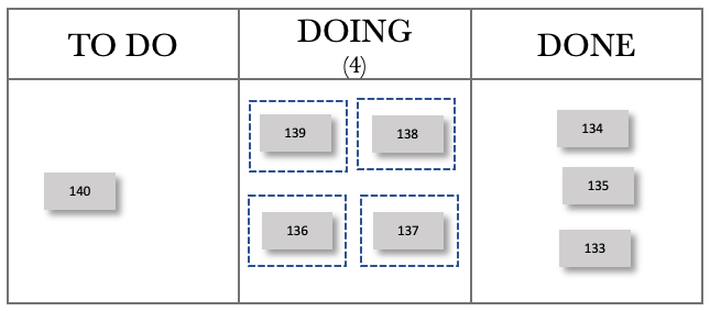
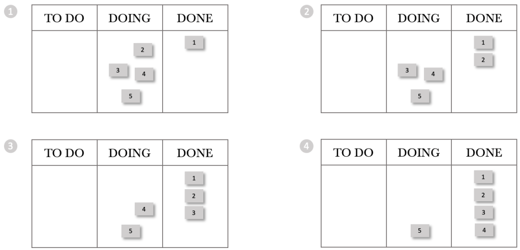
Before we explore treating our boards as systems, I think it’s essential for us to understand how processing order affects lead times. Let’s take our previous example, where we had a CCR limited to servicing four jobs per day and a demand of 5. Let’s first consider a situation where we process in a First In, First Out (FIFO) order. We will number the jobs as they come in and work on the lowest number first. Let’s first set up the board.
We will push these into the DOING column as work comes in daily. The figure below shows the start of Day 1. The ticket numbers reflect their job numbers starting at 1.
The card movements on the board below show progress through the day.
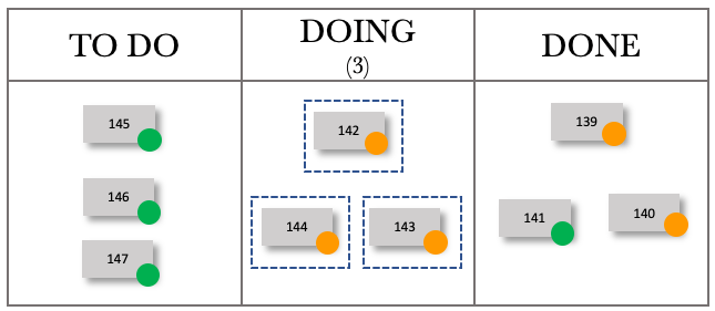
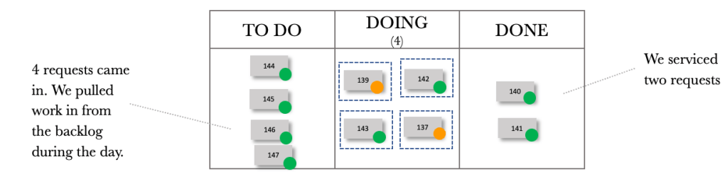
We have processed jobs 1 through 4, and 5 remains in our doing column. Stepping through the next day, we again received five requests and pushed these into the DOING Column.
The sequence for Day 2 is shown below.
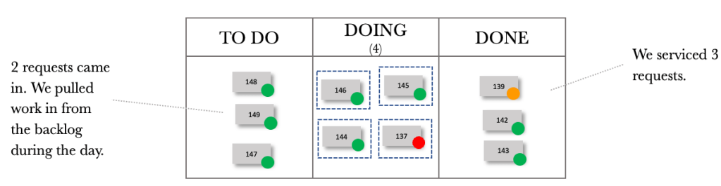
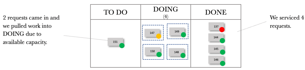
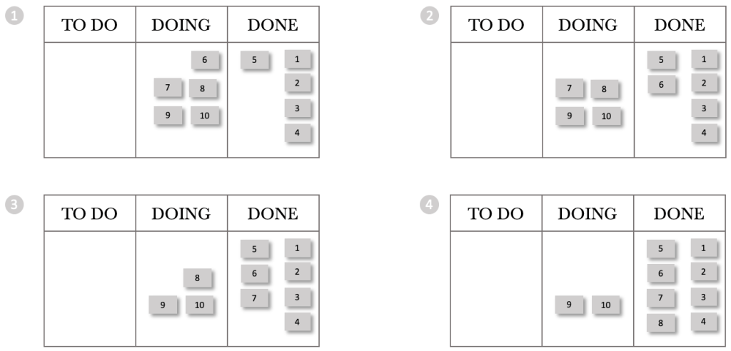
At the end of Day 2, we have processed jobs 5 through 8 and jobs 9 and 10 remain in our doing column. Stepping through the next day, we again received five requests and pushed these into the DOING column. We are starting to see a trend already. Every day we stgh the board, we gain more WIP. Day 1 had a WIP of 1, and Day 2 had a WIP of 2. Logically Day 3 will have a WIP of 3, Day 4 a WIP of 4 and so on. But what about the lead times? We can see from the boards above that we delivered jobs 1-4 on the day they arrived. We delivered job 5 the next day.
Continuing on our journey, let’s look at the end of the day for the next few days.
At the end of day 8, we had completed 32 jobs and had a WIP of 8. The thing for us to note with FIFO is that work that comes in each day falls further and further behind, or in other words, our lead times increase over time. What would happen if we changed our processing order from FIFO to Last In, First Out (LIFO)?
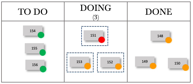
Let’s step through the first day of a LIFO processing pattern. This pattern represents when work enters, and we pick the next item from the top of the pile.
At the end of the day, we have processed jobs 5 through 2 and 1 remains in our DOING column. Stepping through the next day, we again received 5 requests and pushed them into the DOING Column.
The sequence for Day 2 is shown below.
At the end of Day 2, we have processed jobs 10 through 7, and jobs 1 and 6 remain in our DOING column. We see that the pattern between FIFO and LIFO remains intact if we were to use a CFD. In both cases, we complete 4 per day and increase our WIP by one a day. If we were to plot a CFD for 20 days, it would look the same for LIFO and FIFO. Let’s step through the next few days and see what happens with our board.
Continuing our journey, let’s look at the end of the day for the next few days.
At the end of day 8, we had completed 32 jobs and had a WIP of 8. These are the same results for FIFO, but our lead times per job are very different. Let’s construct run charts for the eight days and compare the FIFO and LIFO processing orders.
Consider the FIFO and LIFO Run Charts over the eight days. The Run Charts contain both completed jobs and WIP. I have shown both to compare and contrast the wait times for WIP and the lead times for completed jobs.
Let’s first consider the completed job lead times. For FIFO, we see that the lead times increase over time. Contrasting that with LIFO, we see that all completed jobs had a lead time of 1 day. Considering the wait times for WIP, we see that FIFO’s longest wait time is two days, whilst LIFO has an item waiting eight days to be processed.
What would happen if we processed our jobs in a random order? What would happen to our lead times and wait times then?
Using the same process as before, where we have a demand of 5 per day and have a capacity-constrained resource that can process four jobs per day, let’s look at the run chart for random job processing.
As can be expected, the wait times and lead times for random processing are haphazard. We detect no consistency or pattern.
We can derive from our exploration of processing order that the order in which we process jobs is crucial, especially when we have a CCR in play.
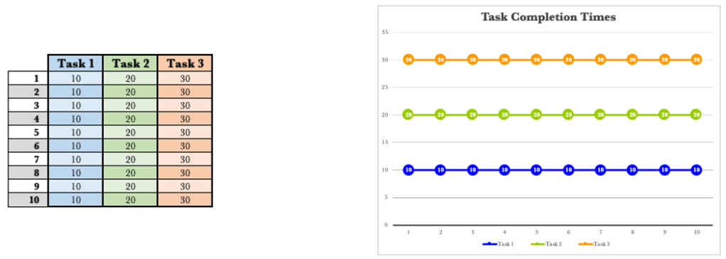
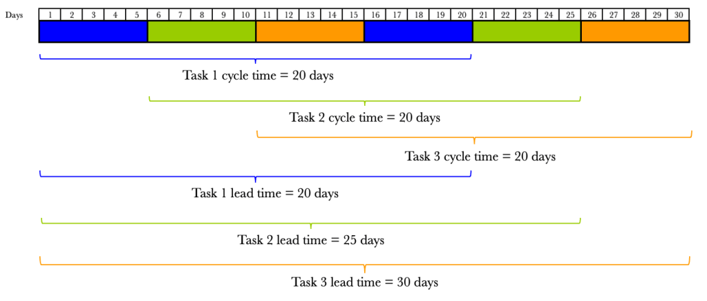
The other area we need to consider is multitasking. Multitasking can have detrimental effects on lead and wait times. Let’s take a look at a simple example below. We will consider three tasks that each take ten days to complete. Let’s start with Single-tasking. We will start a job and not switch until it is complete. We will complete them in the order they are received or FIFO.
We start Task 1 and complete it on day 10. We then pick up Task 2 on the 11th day and complete it on day 20. We pick up Task 3 on day 21 and complete it on day 30. Our lead times of 10 days are predictable for all 3 tasks. If we ran this over 10 iterations, we would expect to see the same thing over and over again. The table and figure below show the results over 10 runs.
There are no surprises here. Every run produces the same output. There is predictability in our lead times.
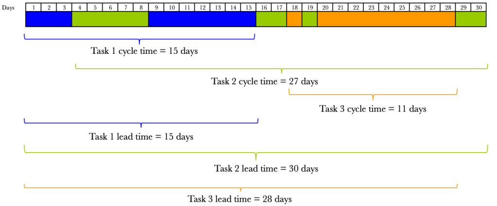
What if, for some reason, we switch tasks every five days? How would this affect our lead times, if at all?
If we consider Task 1, we started on day one and stopped on day 5. We then picked it up again on day 16 and completed it on day 20. Our lead time for Task 1 has moved from 10 days to 20 days. We have, in effect, doubled our lead time by switching tasks halfway through.
Consider Task 2. We started Task 2 earlier than when single-tasking. We started Task 2 on day six and stopped on day 10. We picked it up again on day 21 and completed it on day 25. The lead time for Task 2 with single-tasking was 20 days, and is 25 days for switching halfway. We started Task 2 earlier and finished it later.
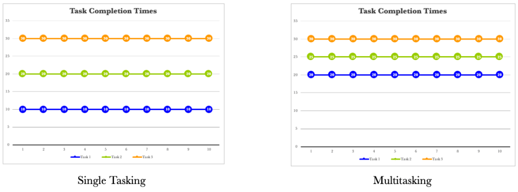
Turning our attention to Task 3. We started task 3 ahead of single-tasking by ten days. We did, however, complete it on day 30, just as with single-tasking. Let’s compare and contrast the results between single-tasking and multitasking when switching halfway through a task.
Let’s consider one more situation where we have multiple but equal switches. Let’s assume that we switch tasks every two days.
The same trend appears again. We tend to start tasks earlier and complete them later, except for task 3, which finishes on the 30th day. The trend diagrams below show that our completion times are progressively later the more frequently we switch tasks.
The more we switch, the more tightly together our three tasks are completed. It is not just the lead times that are affected when we task switch. Our cycle times also vary.
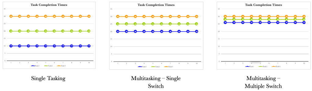
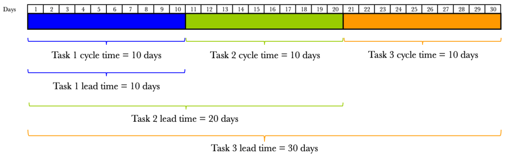
Cycle time is the time the task takes to complete once started. Lead time is the total time from request to fulfilment. Let’s take our previous example and show the cycle times and lead times for each situation. We’ll assume that we receive all tasks on day 1. We will consider the single-tasking example first.
We see that the cycle times for single-tasking are predictable and are all ten days. What we do notice is that our lead times vary. The lead time for Task 1 is 10 days, Task 2 20 days and Task 3 30 days. The varying lead times are due to the amount of time the task sits waiting to be processed. What about when we switch tasks halfway? We have already seen the effects on lead times, but the effects on cycle times are also dramatic.
The figure below shows the effects on cycle times and lead times when we switch tasks halfway through.
By switching tasks midway through, we have doubled our cycle time. It now takes 20 days to complete a task once we have started it. So not only have our lead times increased, but so have our cycle times. Let’s look at the effect of multiple switching.
The figure below shows the effects on cycle times and lead times when we switch tasks on multiple equal occasions.
Again we see the worsening cycle times. The more we switch, the more our cycle times increase. We have already seen that the more we switch, the more our lead times increase.
We also know that life doesn’t allow us to switch tasks in order. In the previous examples, we highlighted trends when we increased switching uniformly. What would happen if we were allowed to start tasks randomly as well as switch on demand? Let’s consider an example.
We now see that our cycle times and lead times are all over the place, and there is no predictability. This is a situation we want to avoid. While we can see the chaos tasking switching causes, many of us work like this daily.
Let’s make a pact now. We need to minimise task switching as much as possible. There will be occasions where we need to switch tasks, which is a fact of life, but for the most part, we need to eliminate task switching.
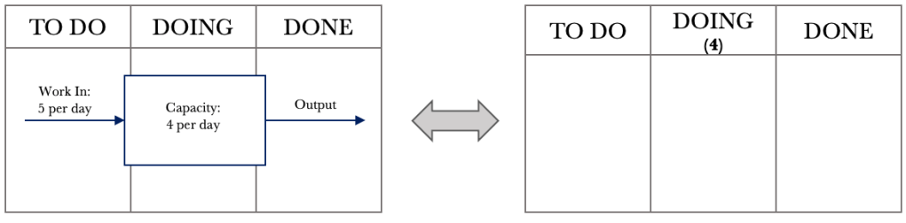
Now that we have considered processing order and task switching let’s go back to our board. As a reminder, we want to start viewing our board in the manner shown below.
Let’s go back to our situation where we have a capacity-constrained resource that can service 4 items a day with a demand of 5 requests per day. Let’s overlay the position on our board.
In the DOING column, we add the number 4 below the DOING label to denote a capacity-constrained resource that can service four requests per day.
From our previous FIFO example, let’s take day eight. We will again assume that we will be processing jobs in the order they are received or FIFO. We will be making some changes to how we manage work and will see their effects one at a time.
We are going to make two changes. One, we are going to move from a ‘push’ system to a ‘pull’ system. What does this mean? Previously, when jobs came in, we would push them into doing as soon as they came in. When jobs come in now, we will place them into the TO DO column. When we finish a job in the DOING column, we will pull a new one from the TO DO column. The second change we will make is to limit our work in progress to our CCR limit. For our example, we have a CCR of 4, so we will have a WIP limit of 4. The ‘4’ that we placed under the DOING column now shows the maximum number of jobs in the DOING column at any one time. Let’s have a look at the effect of these two changes. Consider day nine below.
The jobs that came in are placed in the TO DO column. We can see that our WIP limit in the DOING column has been breached. We have eight jobs when we should only have a maximum of 4. Let’s step through the next few days and see the effects of the changes we put in place.
During day 9, we process jobs 33, 34, 35 and 36. At the end of day 9, we have a board that looks like what is below.
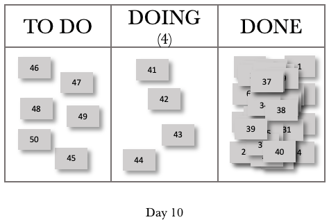
Our board now shows that we are not in breach of our WIP limit. We have accumulated five jobs in the TO DO column. At this stage, we have reduced our WIP by four and have grown our backlog by 5. Let’s look at day 10.
For Day 10, we completed jobs 37, 38, 39 and 40. We pulled jobs 41, 42, 43 and 44 into the DOING column. We also added jobs 46, 47, 48, 49 and 50 to our backlog. These five jobs, and job 45 that was not pulled into DOING, now give us a TO DO or backlog total of 6. Let’s look at one more day.
Consider day 11 below.
Day 11 now mirrors day 10 in behaviour. We completed four jobs. We have four jobs that we are working on, and we have grown our backlog by 1. We can represent this in a systems view, as shown below.
We see from the figure above that we have managed to keep our WIP constant, and our CCR governs our output. We will have a net increase of 1 job per day, accumulating in our backlog or TO DO column.
Let’s take a look at a CFD over 20 days, where we introduced our changes on day 9.
The CFD now shows that we have a constant delivery rate of 4 per day. We had a growing WIP up to day eight, and then this tapered off to a constant of 4 per day. We now see that our backlog is growing as we progress.
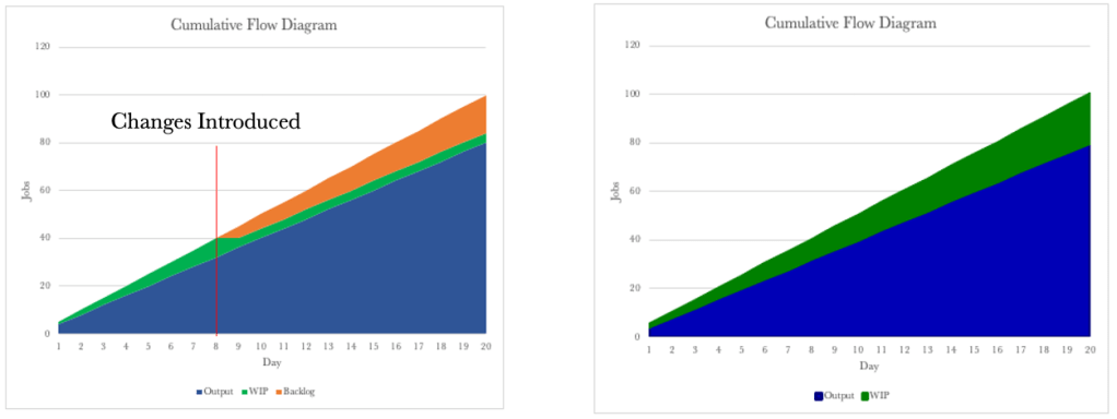
Let’s compare the CFD above with the CFD for the push system.
The CFDs look similar, and it looks like the only change we have made is to move the WIP into the backlog. By putting in place a WIP limit, we have reduced the ability to multitask. The WIP Limit will allow us to focus on finishing the work we have started. We now also have a consistent cycle time.
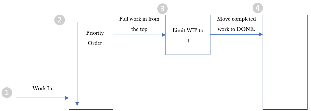
Let’s go back to our systems diagram for the moment and draw it slightly differently to have it represent our way of working.
Let’s step through the diagram from left to right.
Work comes in, and we add it to the list of things to get done.
2. We order the backlog or the jobs in the TO DO column to make it easy to pull work into the DOING column.
3. We pull work into the DOING column from the top of the pile.
4. We move the job to DONE when once completed.
What we have done is limited WIP, and we have deferred commitment to start work by placing it in the backlog or TO DO column. The deferring of commitment provides us with a lot of control. We know that if we start a job, we can complete it with a cycle time of one day. We also know that we can process four jobs a day. We also know that our backlog grows every day. Most of us work with ever-growing backlogs of work. However, we can now take advantage of a deferred commitment and start to order the backlog in a manner that best delivers value to our organisation or customer.
We are now in control of what work we release and when. We can prioritise our work based on what our organisation or customer wants or values most. The most important thing to note is that placing items in our TO DO column will affect the order in which they get delivered. We can now work with our stakeholders to determine what they want to be delivered and in what order. Our order now sets the priority of work to be processed.
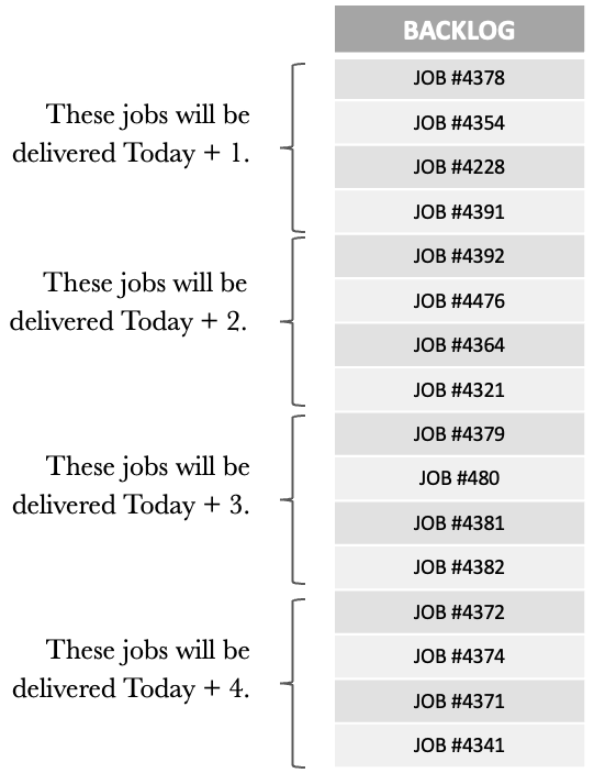
Order is critical as it allows us to work with our customers/stakeholders and helps set and manage expectations. We can provide estimates by knowing our cycle time and our output per day. Let’s go back to our example, where we can process four jobs per day. Take the ordered backlog below into consideration.
Our backlog is now ordered in line with the needs of our customers/stakeholders. Each job gets a sequential number when received, and we can see that our backlog does not align with this order. Instead, it represents the order that aligns with our customer’s/stakeholders’ needs.
Knowing that we can process 4 daily, we can now tell what jobs will be delivered and on what day. We have easy conversations with our customers/stakeholders to show where they are in the backlog and when they can expect their jobs.
We can also work with our customers/stakeholders to change the order of the backlog to cater to any new high-priority jobs. When new higher-priority items come in, we can also show how these will impact other jobs in the backlog and manage expectations accordingly.
Managing our backlog and ensuring that our jobs are in the order that most reflects the needs of our customers/stakeholders is vital for us in moving to a proactive way of working. Getting the backlog under control is probably the most challenging, but also brings the most significant benefit.
So far, we have seen that:
• Our Kanban boards are visual representations of systems.
• Our CCR determines the rate of our output.
• We can use the CFD, Run Chart and Frequency Graph to track work and gain insights into our performance.
• Putting in a WIP limit allows us to focus on finishing.
• Multitasking is destructive and should be minimised as much as possible.
• Deferring commitment allows us to order the work in our backlog to closely match what is wanted most by our organisation or customers.
One of the things we have not spoken about yet is work that gets stuck or blocked once we have started working on it. Let’s round out our discussion on flow by considering the effects of blocked work and look at what we can do about it.
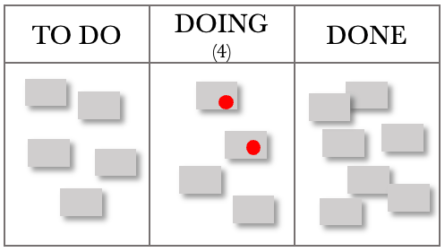
Taking the board below into consideration. Let’s work through blocked items and see what effects this has on how we work. The board below shows a WIP limit of 4, and the cards with a dot on them show blocked work.
Considering the situation above, we have obeyed our WIP limit, and two jobs are blocked. They could be blocked for several reasons, e.g., waiting for feedback/input/expertise or simply not having everything we need and so need to complete the work. However, this situation leaves us with an underutilised capacity to work on a task that is now blocked, and we cannot pull a new one from the backlog.
We need to modify our board slightly when dealing with situations where work is blocked, as per the figure below.
We create another swim lane within our DOING column and place all blocked work here. We don’t need to add any WIP limits to the BLOCKED column. The board below shows an updated view.
We can now pull another two tasks into the DOING column and commence processing work on other jobs. Our role as managers comes into play when we have blocked work. Our job is to determine why they are blocked and ensure this does not recur. The rest of the board belongs to the team, but the BLOCKED section is ours.
We could also have one team member work on the blocked items while the rest continue to service requests. Once requests become unblocked, we must pull them from the BLOCKED column before getting new work from the TO DO Column.
As managers, we are looking for patterns that cause work to get blocked and eliminate them. We are also proactively looking for ways to ensure that once we start something, we can finish it. The BLOCKED section of the board provides feedback on where to focus our efforts so that we maintain a steady flow of work through our department. One of the managerial changes that we should add to the board is a ‘FULL KIT’ column. This column checks to see if we have everything to complete the job. If we don’t have everything, we should not start it. Let’s look at the modified board below.
Our board now provides us with a good structure for most situations.
• Our TO DO column collects all the work expected of us. We can then order and release the most valuable work to the organisation or customer, ensuring they receive the high-value items first.
• The FULL KIT column provides a check to ensure a high likelihood of us completing the job when we start it. If we find that we are often missing items in this stage, this provides excellent feedback on where to focus our attention and eliminate those deficiencies.
• The DOING column limits our WIP, ensuring we focus on finishing.
• The BLOCKED column provides managerial focus and feedback that we can use to eliminate the situations that cause and result in blockages.
• The DONE column records the excellent work we have delivered.
We now have a functional, templated Kanban board that we can use as a start and build on if we don’t already have one. The board, the CFD, the Run Chart and the Frequency Graph will provide the insight and information needed to manage and improve your work.
After spending a few years as a systems engineer, I got the opportunity to try my hand at management. My first few management roles were technical leadership positions. I led small to medium-sized teams, and my technical know-how was enough to get me through. I thought I was managing, but in reality, I was reacting to the day’s situation. My team and I would put in the hard work and the long hours to get whatever needed doing; done. It was not great; we were constantly overwhelmed and felt there was no way out. Sigh.
I needed a better way. I felt like there must be something I was missing. How could all the other managers make it look so easy? Was I missing something? I knew I had the ability, and I just lacked the knowledge. I embarked on a post-graduate degree in Engineering Management, thinking that salvation must lie in the hallows of the holy institutions. I came out of there with a greater appreciation of management and started to apply what I had learned. Sadly, the results were short-lived. I was better, but I found myself in the same situation of being overwhelmed with work and needing to put in mammoth hours to get on top of things again.
I wasn’t done yet, not by a long shot. By pure chance, I happened on the Theory of Constraints and its Logical Thinking Processes. At that point, I had no idea of the immense power of systems thinking. I delved deeper into systems thinking, reading everything I could about it. I decided to dig even deeper and took a Graduate Certificate in Constraints Management at Washington State University to find out more. Here, I met Dr. Russ Johnson, who turned my world upside down. I felt like this was what I had been searching for all along.
I now had the knowledge and could use it to manage work effectively. The challenge now was to turn it into a practical mechanism for daily use and make it easily accessible to everyone. Fortunately, I did not have to look far. Everywhere I worked, people were using Kanban boards to visualise their work but not using them to their full potential. And this is when it hit me, why not use the systems thinking tools to unlock the full potential of the Kanban boards?
I hope you enjoy what I have shared in this book. The lessons I have learned and continue to learn when applying these simple rules to work have resulted in me enjoying going to work and, most importantly, have given me confidence in my managerial skills. Once you have the knowledge outlined in this book, you will manage your work and not have it control you.
One of the life lessons I gained while being coached as a kid stuck with me my whole life. My coach said to me, “If you think you can’t, you won’t“. I remember, during my undergrad, having to go through control engineering. Man, I wouldn’t say I liked control engineering. Any opportunity to avoid it, I took. Then I heard my coach’s voice in my head, ‘If you think you can’t, you won’t’. That was it; I printed out that saying and stuck it on my wall. Every time the subject of control engineering came up, I looked at the sign and got to work. That little saying has gotten me through a lot. It was the rod I used to search for a better way. Still today, I catch myself thinking, ‘If you think you can’t, you won’t‘.
I recall my first day in Level 6 Physics at high school. I entered the classroom and saw this young man standing in front of the class. Wow, I thought, what is this young gun doing teaching physics. It looks like he left school last year. We settled down, and he introduced himself. He said the most profound thing, ‘You can’t learn physics yet because you haven’t yet learned how to think properly’. Ha! What? At the time, I remember smirking; what did he mean? We didn’t know how to think? We had been in school for what felt like an eternity! Of course, I learned how to think. So I thought, but boy, was I wrong.
He was right. I didn’t know how to think. That is, I didn’t know how to think logically. He taught us how to think logically by having us do logic puzzles for the first three months of our study. At the time, I thought we had wasted all that time on puzzles. I hoped he knew what he was doing. Once we did start on physics, boy did we race through the syllabus and aced our exams to boot. Our ability to think logically gave us the upper hand.
I am going to borrow from my young gun physics teacher and take the same approach. No, we’re not going to do logic puzzles, but we will start thinking correctly before we go into unlocking the power of Kanban. We are going to start with some essential Kanban and systems thinking. We will then build on that foundation and deal with the more complicated situations we find ourselves in as part of our working lives.
I recommend you practice what you learn one at a time, especially if you have existing boards. Both you and your team will need time to adapt to the changes you introduce. Taking this approach is the path of least resistance when working in a group. The team members get to experience first-hand the outcomes of each change.
I have received the same advice above in reading other books and have never listened to it, instead choosing to make a wholesale change to get maximum benefit. If you are wired that way, then I am not going to stop you. Go for gold! You may meet with resistance from the broader team as they try to get their heads around the changes you have put in place. Some of the things I suggest are counterintuitive, and some team members may ignore your requests. Remember, ultimately, our role is to make work flow as smoothly as possible and service our customers as fast as possible. Either approach will get you there. One is more inclusive. I leave it to you to choose which you prefer.
A quick note about my writing style: it will be evident through the book that I am not a writer. Not by a long shot! I have formatted the text to most resemble a presentation I would provide to one of my clients. The words I use are more aligned with if I were delivering this as a presentation to you. In some instances, the tone is more conversational; in others, it is more informational. I intend to let the information presented do the talking and not have me fill the gaps with many words that won’t make much of a difference to the underlying message.
We have recently delivered several Team Kanban Professional courses from the Kanban University. What has been noticeable for us is that while our learners go back to their offices and implement the TKP learnings, some of the learners do not extend the Kanban principles to the individual level.
Digging deeper has led to us uncovering the presence of the To-Do list at the individual level. The learner has been using a To-Do list for years now and relies on that list to get things done. The To-Do list is their safety blanket. Often, a To-Do list is much easier to add stuff to as it makes for quick capture of information.
So how do we get the best of both worlds? Is it even possible? Let’s consider the 6 General Practices from the Kanban Method, outlined below, and see if we can apply them to a To-Do list.
Visualise
Limit Work in Progress
Manage Flow
Make Policies Explicit
Implement Feedback Loops
Improve collaboratively, evolve experimentally
Taking them one at a time lets first consider Visualise. Most To-Do lists do an excellent job of visualising work. They don’t use a kanban board but certainly do provide a good visualisation platform for what we have on our plate. Consider the hypothetical To-Do List below.
Frank’s To-Do
Update Website with SAFe information
Automate Invoicing
Contact Dave about Kanban Training Opportunity
Plan out next quarter
Add DevOps Leader course to training pack
Update CRM with new client ACME Inc. details
Pay utilities
Install remote conferencing and training technology
Arrange financial review session with the accountant
This list does a great job in quantifying the work Frank has on at the moment. Frank does not use a priority system and picks one and starts working on it. Frank works on more than one thing, and at least 50% of the list above is in progress. We can improve our visualisation of Franks list by adding some headings to the list.
Frank’s To-Do
To-Do
Automate Invoicing
Plan out next quarter
Pay utilities
Doing
Add DevOps Leader course to training pack
Update CRM with new client ACME Inc. details
Install remote conferencing and training technology
Arrange financial review session with the accountant
Update Website with SAFe information
Contact Dave about Kanban Training Opportunity
Done
We have improved the visualisation of Frank’s work. We can see that Frank likes starting work before completing in-progress work. Now that we have this basic To-Do list structure in place, let’s consider the second Kanban General Practice Limit Work in Progress.
Work in Progress or WIP has a direct correlation to Lead Times. So it follows that limiting WIP will improve our Lead Times and also bring about due date delivery predictability. (This is out of scope for this article, but if you would like to find out more, please contact the team at @Frank Innovation and Transformation). Our next step in improving Frank’s To-Do list to add some WIP limits. Frank’s To-Do list now looks like this.
Frank’s To-Do
To-Do
Automate Invoicing
Plan out next quarter
Pay utilities
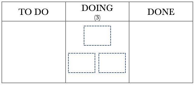
Doing (3)
Add DevOps Leader course to training pack
Update CRM with new client ACME Inc. details
Install remote conferencing and training technology
Arrange financial review session with the accountant
Update Website with SAFe information
Contact Dave about Kanban Training Opportunity
Done
We have added a 3 in brackets to Frank’s list. This 3 signifies that Frank should only have three active tasks that are in-progress. At this stage, Frank will not be able to start any new work until Frank has reduced the activity in Doing to below 3. At first, this does seem counter-intuitive, but lead times will improve and so will due-date delivery.
The third Kanban General Practice is to Manage Flow. We can make further enhancements to Frank’s To-Do list to Manage Flow. Let’s add two more sections that help improve the flow of work through Frank’s To-Do list. Let’s look at Frank’s new To-Do List below.
Frank’s To-Do
To-Do
Automate Invoicing
Plan out next quarter
Pay utilities
Next (2)
Add DevOps Leader course to training pack
Arrange financial review session with the accountant
Doing (3)
Update CRM with new client ACME Inc. details
Install remote conferencing and training technology
Update Website with SAFe information
Waiting
Contact Dave about Kanban Training Opportunity
Done
Frank’s work now flows from To-Do to Next to Doing to Done. The Waiting heading shows that Frank needs input from someone else before progressing this activity. Once Frank has received feedback, this task can be added to the Doing section if the WIP limit permits.
We can now consider the fourth Kanban General Practice of Making Policies Explicit. Making Policies Explicit defines how Frank is to treat work under each of the sections and the To-Do list as a whole. The updated To-Do List below shows Frank’s policies.
Frank’s To-Do
Policy: Only add work to this list that brings us closer to being the best transformation consultants in New Zealand.
To-Do
Policy: All work goes here. Frank only works on items that are on this list.
Automate Invoicing
Plan out next quarter
Pay utilities
Next (2)
Policy: The next two most important items that require Frank’s attention.
Add DevOps Leader course to training pack
Arrange financial review session with the accountant
Doing (3)
Policy: Only three or less work in progress items.
Update CRM with new client ACME Inc. details
Install remote conferencing and training technology
Update Website with SAFe information
Waiting
Policy: Items listed here require additional information before they can proceed. On receipt of the information and if WIP limits permit, the task is moved to Doing.
Contact Dave about Kanban Training Opportunity
Done
Policy: Move items here when all Definition of Done criteria are satisfied.
Franks To-Do list is starting to resemble a Kanban system. Next, let’s look at the fifth Kanban General Principle – Implement Feedback Loops. Feedback Loops allow us to assess how efficiently our system is performing. For Frank’s To-Do list, the main thing for Frank to keep an eye on is how many occasions work is started and then either discarded or moves to Waiting. This indicator will help Frank improve the flow of work through his To-Do list.
The sixth principle is Improve Collaboratively, Evolve Experimentally. While there is not much room to improve collaboratively, we certainly can improve the To-Do list. One of the items Frank noticed when using the task list for a while was that tasks were frequently started and then put into Waiting. Frank realised that if he ensured that in the Next section of the To-Do list that everything was present before beginning the task that the flow of work not only improved but the To-Do list became more efficient and effective. Frank updated the To-Do list policies and is currently using the list shown below.
Frank’s To-Do
Policy: Only add work to this list that brings us closer to being the best transformation consultants in New Zealand.
To-Do
Policy: All work goes here. Frank only works on items that are on this list.
Automate Invoicing
Plan out next quarter
Pay utilities
Next (2)
Policy: The next two most important items that require Frank’s attention. Things can only move to Doing once everything is available for work to commence.
Add DevOps Leader course to training pack
Arrange financial review session with the accountant
Doing (3)
Policy: Only three or less work in progress items.
Update CRM with new client ACME Inc. details
Install remote conferencing and training technology
Update Website with SAFe information
Waiting
Policy: Items listed here require additional information before they can proceed. On receipt of the information and if WIP limits permit, the task is moved to Doing.
Contact Dave about Kanban Training Opportunity
Done
Policy: Move items here when all Definition of Done criteria are satisfied.
Frank has successfully adopted all of the Kanban General Principles using a To-Do list. Using the General Principles with Frank’s favourite To-Do list has now reduced Frank’s lead times and improved due-date delivery.
Pro-tip – if you are using an electronic To-Do list, you can hide the policies, so you are only focussed on the work that you need to do. They will always be there for you to review and amend as circumstances change. If you are a To-Do list superuser, you can use tags to enrich your list further. Electronic To-Do will also make your life easier by allowing you to add due dates and create recurring tasks.
Just like Frank, you too can apply the Kanban General Principles to your task list. I hope you have fun using these principles and start delivering faster with less distraction.
Welcome to the inaugural post for The Focussed Manager. I am quite excited to launch this site. For a long while, I was looking for a medium to share some of what I have learned from TOC (Theory of Constraints), DevOps and Agile and to also share some of my opinions. The motivation for pulling this site together is a common phrase I think we all use from time to time, ‘If only I had known this then…’
This site is dedicated to the things I wished I knew when I went into Management in I.T. Whilst it was those experiences that shaped who I am today, I still would have appreciated the assist. I hope you find many of the Aha’s that I did in learning the stuff I have put up here…